An Organic Modern Valentine’s Day Home: Romantic Without Feeling Themed

An Organic Modern Valentine’s Day Home: Romantic Without Feeling Themed
A soft, elevated approach to Valentine’s styling—where the home still feels like your home. Think warmth, quiet romance, and natural texture (not bright red decorations).
A home can feel romantic without looking like a theme party. The most elevated seasonal styling works the way a high-end outfit does: one subtle change at a time—tone, texture, and a hint of warmth—layered onto a strong foundation.
What you’ll learn
- The “romance without red” palette approach
- How to style 3–5 intentional moments (not the whole house)
- Where Valentine’s accents look elevated (and where they look cluttered)
- How to keep your home feeling custom and calm even in seasonal mode
Builder-Grade → Custom Series (Internal Links)
Keep this identical across all six posts for strong internal linking and SOE-friendly structure. (Everything returns to the Design hub.)
| Article | Title | What you’ll learn |
|---|---|---|
| 1 | Design Essentials | Foundational decisions that elevate any space—no renovation required. |
| 2 | Form & Proportion | Scale, spacing, balance—how to fix the “something feels off” problem. |
| 3 | Material & Texture | Depth and warmth through finishes and textiles (without clutter). |
| 4 | Home & Organization | Systems that keep daily life from landing on every surface—so the home reads custom. |
| 5 | Organic Modern Valentine’s | Romantic without being themed: a soft, elevated seasonal approach. |
| 6 | Early Spring Refresh | Subtle shifts that make your home feel lighter, calmer, and renewed. |
The Palette Rule: Romance Without Red
The easiest way to keep Valentine’s styling elevated is to treat it like a tonal story—not a color blast. Instead of bright red, lean into a soft spectrum: warm ivory → blush → muted rose → cocoa. It reads romantic because it’s warm, not because it’s loud.
Base stays neutral
Keep your everyday palette (the one that already feels custom). Valentine’s is an overlay, not a rewrite.
If your base feels flat, revisit Material & Texture.
One accent family
Choose one romantic accent family (blush/rose/cocoa) and repeat it in small, intentional ways across the home.
Repetition is what makes seasonal styling look “designed,” not random.
Editor’s shortcut
If you want Valentine’s to feel expensive: reduce the number of items and increase the quality of the composition. Fewer moments, better spacing. (That’s proportion in seasonal form.)
Style 3–5 “Moments,” Not the Whole House
High-end seasonal styling is strategic. Choose a few places where the eye naturally lands, and keep everything else calm. This is how you get romance without clutter.
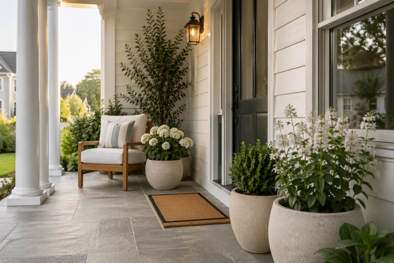
Moment 1: The entry (first impression)
Keep it airy: one warm-toned accent, one natural texture, and a clean surface. Romance reads best when the entry is calm.
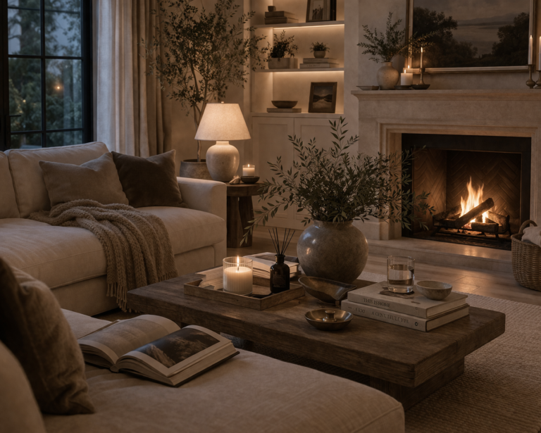
Moment 2: The coffee table or main surface
Think “soft edit,” not “holiday centerpiece.” Use layered neutrals, then introduce a single romantic note (tone + texture).
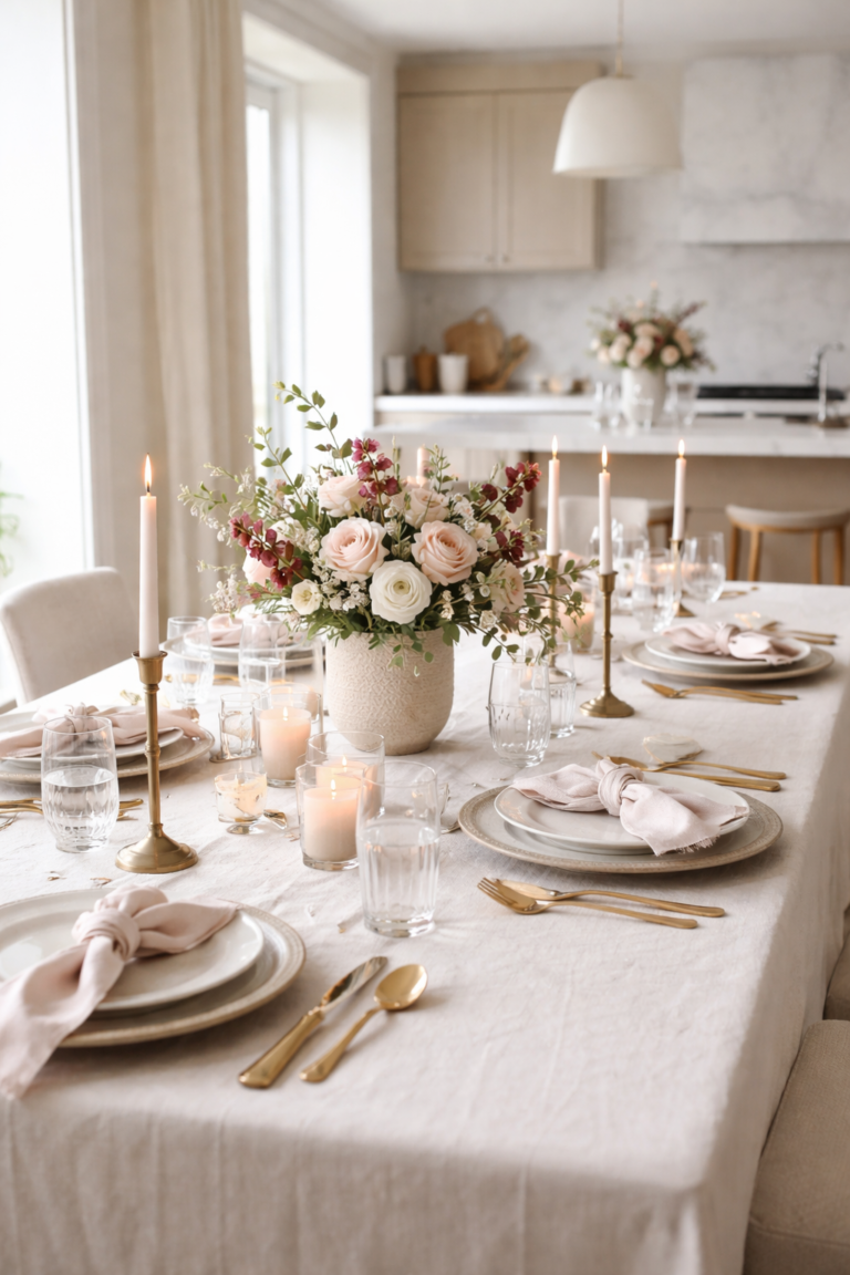
Moment 3: Dining (simple and luminous)
Valentine’s here should feel like candlelight energy—warm, minimal, and slightly elevated.
Moment 4: Bedroom (quiet romance)
Subtle shifts: warmer neutrals, a soft blush note, and texture. A bedroom becomes romantic when it feels calm and intentional.
The “No-Theme” Checklist
- Repeat one tone (blush/rose/cocoa) in two or three places.
- Keep surfaces edited so the home still reads custom.
- Use natural texture to ground the romance (woven, linen-like, matte ceramics).
- Avoid scattered icons (hearts everywhere = themed). One subtle nod is enough.
- Let lighting do the mood (warm glow reads more romantic than décor).
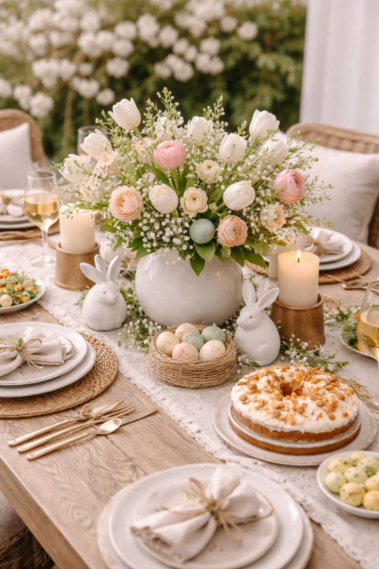
Visual example: romantic, elevated, not themed
Notice how the styling feels soft and warm—without turning the space into a holiday set. The home still reads custom because the base decisions (proportion, texture, organization) remain intact.

FAQ: Organic Modern Valentine’s Styling
How do I make Valentine’s décor look elevated instead of kitschy?
Use a tonal palette (ivory → blush → muted rose → cocoa), limit yourself to a few intentional moments, and keep surfaces edited. If you need a rule: fewer items, better spacing.
Do I need to use pink or hearts for it to feel like Valentine’s?
Not at all. Valentine’s can be “felt” through warmth: soft lighting, gentle contrast, and a romantic tone family. One subtle nod is more high-end than repeated icons.
Where should I focus if I only style one area?
The main surface you see daily (coffee table, dining table, or entry console). A single well-composed moment will change the feel of the whole home.
How do I keep my home from feeling cluttered during seasonal styling?
Start with organization: clear landing zones and a quick reset system. Seasonal styling looks best when your base surfaces are calm—see Home & Organization.
Series navigation: #1 Essentials · #2 Proportion · #3 Texture · #4 Organization · #5 Valentine’s · #6 Early Spring