Builder Grade to Custom Luxe

Material & Texture: The Secret to Making Builder-Grade Homes Feel Layered and Luxe
How stone, wood, textiles, and finishes create depth and warmth—so your home feels intentional, calm, and quietly expensive (without needing a renovation).
Most builder-grade homes don’t feel “builder-grade” because of the layout. They feel that way because the surfaces are visually flat. The good news: depth is designable. When you learn to layer materials (what things are) and texture (how they catch light), the entire home starts to read custom—without adding clutter.
What you’ll learn
- How high-end rooms look rich while staying neutral
- The “texture ladder” that prevents flat, builder-grade spaces
- A simple finish-mixing rule that keeps everything cohesive
- Room-by-room texture maps you can copy
Builder-Grade → Custom Series (Internal Links)
This series is designed as one connected framework. Keep this table consistent across all six posts for clean reader flow and strong topical authority. (All roads lead back to the Design hub.)
| Article | Title | What you’ll learn |
|---|---|---|
| 1 | Design Essentials | Foundational decisions that elevate any space—no renovation required. |
| 2 | Form & Proportion | Why scale, spacing, and balance matter more than décor—and how to fix “something feels off.” |
| 3 | Material & Texture | How finishes and textiles create depth and warmth, so a home feels custom and calm. |
| 4 | Home & Organization | Simple systems that make everyday life look intentional (because it is). |
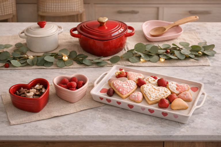
| 5 | Organic Modern Valentine’s | Romantic without being themed: a soft, elevated seasonal approach. |
| 6 | Early Spring Refresh | Subtle changes that make your home feel lighter, calmer, and renewed. |
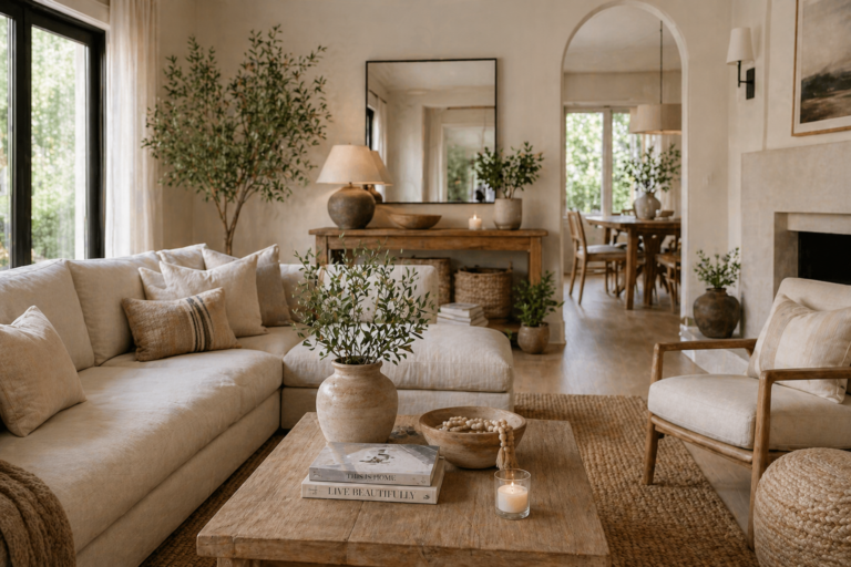
The Texture Ladder: Why Neutral Rooms Still Feel Rich
Many builder-grade spaces try to “fix flatness” with more décor or more color. But the fastest path to a high-end read is simpler: layer texture, then let a restrained palette do the rest.
Think like a magazine spread
A luxurious room has contrast—but it’s subtle: soft beside structured, matte beside gentle sheen, warm beside cool. Texture is the contrast that doesn’t shout.
Step 1: Start with the “quiet base” textures
- Matte paint (calm backdrop that doesn’t glare)
- Natural-looking flooring (a consistent, grounding plane)
- Soft textiles (curtains, upholstery, bedding—these create instant warmth)
Step 2: Add two “character textures” (not five)
- Wood grain for warmth and movement
- Stone or ceramic for weight and quiet contrast
- Woven fibers (basket weave, grasscloth feel, boucle-like softness) for depth
Step 3: Finish with controlled sheen
Sheen is the most underrated luxury tool. One or two reflective moments—think a soft-glow metal, a glazed ceramic, or a gentle glass surface— gives the room dimension. Too many shiny items reads chaotic. Just enough reads curated.
The Finish-Mixing Rule That Keeps Everything Cohesive
Builder-grade homes often feel “random” because finishes feel like separate decisions. A custom home feels elevated because finishes repeat with intention.
Choose 1 dominant metal direction
Warm, cool, or intentionally mixed. The key is repetition: use your dominant metal across multiple rooms so it reads like a house decision—not a room decision.
Repeat 1 wood temperature
One consistent wood “family” makes builder-grade spaces feel instantly more tailored—especially in open concept layouts where rooms visually connect.
Use 1 stone tone as a neutral anchor
Stone (or stone-like tones) creates weight. Even when used sparingly, it makes a home feel grounded and more architectural.
Control contrast (soft, not harsh)
High-end rooms rarely use extreme contrast everywhere. Keep contrast purposeful: one strong moment, then supporting neutrals that feel calm.
Editor’s shortcut
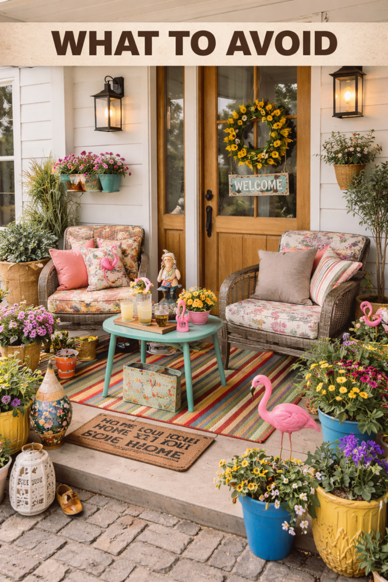
If your home feels “busy,” reduce the number of material voices. A custom look is usually achieved by subtracting one competing finish—not adding another.
Room-by-Room Texture Maps (Copy This)
Use these “maps” to keep texture intentional. The idea: each room has a base, two character textures, and one controlled sheen moment. This creates depth without clutter.
Living Room
Base: soft upholstery + matte walls
Character: wood grain + woven texture
Sheen: one soft-glow metal or glazed ceramic moment
Bedroom
Base: layered bedding + calm neutrals
Character: textured weave + warm wood
Sheen: gentle lamp glow + one reflective accent
Kitchen / Dining
Base: consistent cabinetry tone + matte surfaces
Character: stone-like weight + wood warmth
Sheen: controlled metal repetition (not mixed randomly)
Entry / Hallway
Base: clean lines + negative space
Character: one structured texture (wood or stone) + one soft (textile/woven)
Sheen: subtle mirror/glass moment for light
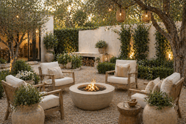
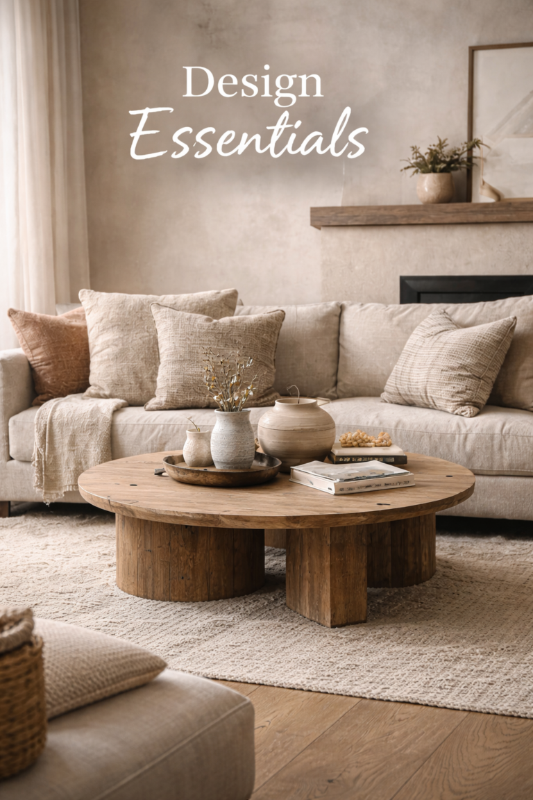
Visual example: layered, luxe texture (without feeling busy)
Use this image as your reference point: notice how the room feels warm and dimensional even if the palette stays restrained. That’s texture doing the heavy lifting.

FAQ: Material & Texture
Why do builder-grade homes feel “flat,” even when they’re clean and new?
Newness isn’t the issue—uniformity is. When surfaces are similar in sheen and texture, light has nothing to catch. Layering a few intentional textures creates dimension and warmth that reads custom.
How many textures should I use in one room?
Aim for a calm base + two character textures + one controlled sheen. This is enough to feel rich without becoming visually noisy.
My home is open concept. How do I keep finishes consistent without making everything matchy?
Repeat the “families,” not the exact items: one metal direction, one wood temperature, and one stone tone. Vary texture and shape so the home feels cohesive, not copied.
What’s the most common mistake people make when trying to add “luxe” texture?
Adding too many small textured objects. High-end rooms usually do the opposite: fewer pieces with better scale. If your room still feels off, revisit Form & Proportion.
Series navigation: #1 Essentials · #2 Proportion · #3 Texture · #4 Organization · #5 Valentine’s · #6 Early Spring