Form & Proportion: The Design Rule That Instantly Makes a Home Feel High-End
Builder-Grade → Custom Series • Article 2 of 6
Form & Proportion: The Design Rule That Instantly Makes a Home Feel High-End
Why scale, spacing, and balance matter more than décor — and how to use proportion to make a builder-grade home feel intentionally designed.

If you’ve ever walked into a home and felt an immediate sense of polish — even without expensive finishes — you’ve felt form and proportion at work. This is the design rule that rarely gets posted, yet it’s the reason some rooms feel elevated and others feel “almost.”
Builder-grade homes often miss proportion in small, repeatable ways: undersized art, furniture that floats without purpose, rugs that stop short, lighting that’s scaled for the box instead of the room, and spacing that feels accidental rather than intentional.
When a room feels off, people often buy more décor. Most of the time, the fix isn’t “more” — it’s right-sizing. Proportion creates that high-end calm: fewer pieces, better decisions.
The One Rule: The Room Should Read as a Complete Composition
Think of your room like a magazine spread. The eye wants a clear hierarchy — one or two primary moments, supported by quieter elements. Proportion is how you set that hierarchy. It’s not about trends. It’s about how the room behaves.
Three proportional cues that instantly raise a space
- Scale: Pieces feel appropriately sized for the wall and room, not “close enough.”
- Spacing: Breathing room exists on purpose — not because nothing fits.
- Balance: Visual weight is distributed (height, width, and mass feel steady).
The Builder-Grade Proportion Traps (and the Fix)
1) The “tiny rug” effect
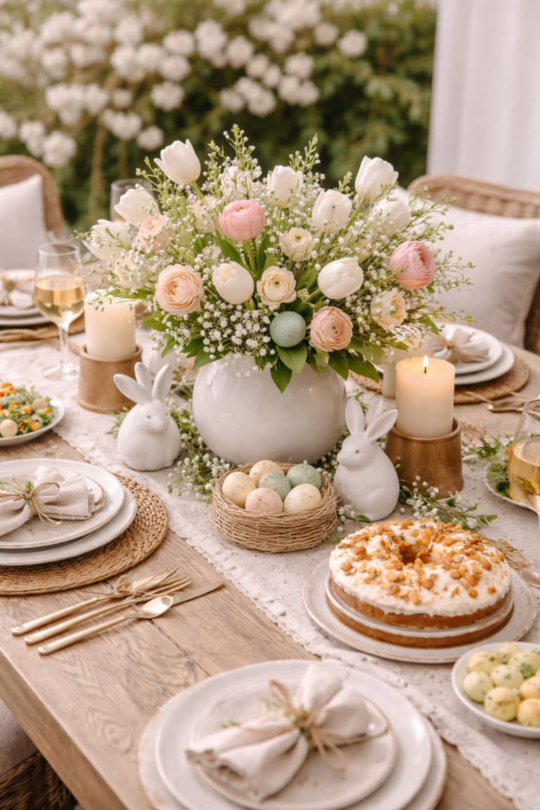
A too-small rug makes furniture look disconnected — like it’s hovering. A custom-feeling room has a rug that anchors the seating. If a rug can’t frame the conversation area, the room reads temporary.
At least the front legs of major seating should sit on the rug. If everything is off the rug, the room will feel smaller and less finished.
2) Underscaled art (the “postage stamp” wall)
Builder-grade walls are often tall and uninterrupted. Small art makes the wall feel emptier — not curated. A custom home uses scale to create confidence: art that can stand up to the architecture.
3) Floating furniture with no alignment
When furniture doesn’t align to something — a rug, a fireplace, a window axis, a centered light — the space feels improvised. Alignment is the invisible thread that makes a home feel designed.
The Proportion Method: A Simple Room-by-Room Framework
The 5-Step “Custom Read” Reset
- Choose your anchor. One primary piece or moment: a sofa, bed, dining table, or statement light. Everything else supports it.
- Set a clear centerline. Center art over furniture, align lighting to the table, balance nightstands, and keep focal points intentional.
- Increase scale before adding items. Go larger with fewer pieces: bigger art, fuller curtains, a rug that actually anchors the room.
- Create breathing room bands. Leave intentional negative space: between furniture and walls, between frames, and around key moments.
- Repeat a proportion, not a style. Consistency comes from repeating heights, widths, and spacing patterns — even across different rooms.

Room-Specific Proportion Cheats (The Ones Designers Actually Use)
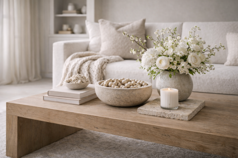
Living Room
- Rug anchors the seating. The conversation area should feel framed, not scattered.
- Art relates to the furniture width. Aim for art (or a set) that visually matches the scale below it.
- One “tall” element balances the room. A floor lamp, drapery height, or a larger plant prevents a flat horizon line.
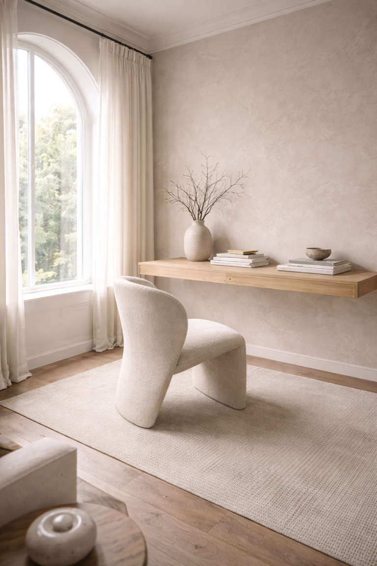
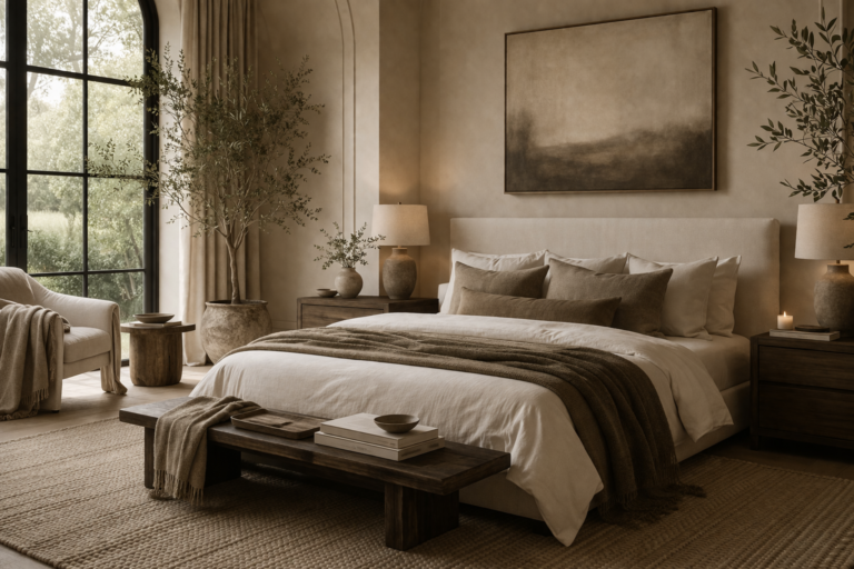
Bedroom
- Bedside scale matters. Nightstands and lamps should feel proportionate to the bed — not miniature.
- Headboard wall reads as a whole. Centering and spacing between art and furniture should feel deliberate.
- Keep pathways generous. A custom-feeling bedroom is calm because circulation is easy.
Entry + Hallways
- Use a confident anchor. A console that fits the wall (not a narrow afterthought) sets the tone.
- Spacing creates luxury. Don’t cram: fewer elements with better scale looks higher-end instantly.
Series Navigation: Builder-Grade → Custom (Read These in Order)
These six articles are designed to work together. Use this table to move through the full framework (and to keep the series tightly connected for SEO and reader flow).
| Article | Title | What you’ll learn |
|---|---|---|
| 1 | Design Essentials: How to Make a Builder-Grade Home Feel Custom | Foundational choices that elevate any space — no renovation required. (The starting point for the entire series.) |
| 2 | Form & Proportion: The Design Rule That Instantly Makes a Home Feel High-End | How scale, spacing, and visual balance create a “custom read” — even with simple finishes. |
| 3 | Material & Texture: The Secret to Making Builder-Grade Homes Feel Layered and Luxe | How to add depth and warmth with smart texture choices that look intentional (not busy). |
| 4 | Home & Organization: Simple Systems That Make Builder-Grade Homes Feel Intentional | When function becomes design: the systems that make a home feel calm, elevated, and “put together.” |
| 5 | An Organic Modern Valentine’s Day Home: Romantic Without Feeling Themed | A soft, elevated seasonal approach that reads like design — not décor. |
| 6 | Early Spring Refresh: Lightening Your Home Without a Full Redecorate | Subtle shifts that make your home feel fresh and renewed — while staying timeless. |
Want more foundational design guidance? Browse the full archive here: https://myproperhouse.com/design/
FAQ: Form, Proportion & a High-End Look
What’s the fastest proportion fix if a room feels “builder-grade”?
Increase scale before adding more items. Start with the rug and art sizing, then confirm furniture alignment to a focal point. Bigger (done thoughtfully) reads more custom than “more.”
How do I know if my art is too small?
If the wall still feels empty after hanging, it’s usually a scale issue. Art should relate to the width of the furniture below it, and it should hold its own against tall builder-grade walls.
Can a home feel high-end without changing finishes?
Yes. Proportion is foundational. When scale and spacing are correct, the home feels calmer and more intentional — which is what reads “custom.”
Is symmetry required for a high-end look?
Not required — but balance is. Symmetry is one easy path to balance. Asymmetry can look even more elevated when the visual weight is thoughtfully distributed.
What’s the biggest spacing mistake people make?
Filling every surface. High-end rooms use negative space intentionally. Leave breathing room so the pieces you keep feel more important.