Spring Porch Color Pallettes
Spring Porches • Color Theory • Organic Modern
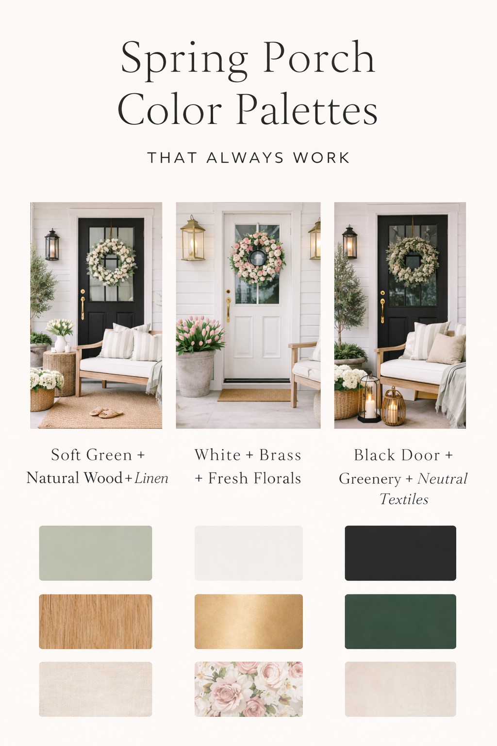
Spring Porch Color Palettes That Always Work
These are the calm, designer-approved spring porch palettes that look fresh every year— never trendy, never busy, and always elevated.
How designers think about spring color
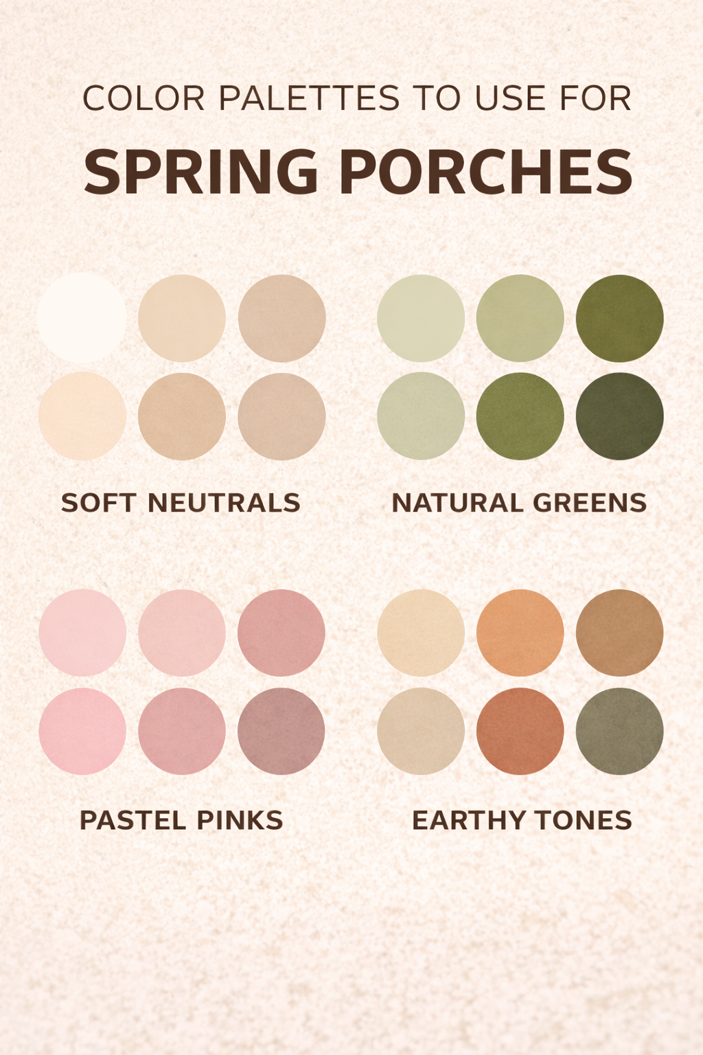
A spring porch palette should feel lighter, not louder. Designers rely on neutrals + natural materials, then layer in one gentle seasonal signal. The result feels fresh, airy, and expensive—without trying too hard.
Editor Insight
If every item has “spring color,” the porch loses focus. A successful palette uses restraint: one accent, repeated calmly.
Soft Green + Natural Wood + Linen
Best for: classic front porches, covered entries, traditional homes
This is the most timeless spring porch palette. Soft green adds life, while linen and warm wood keep the look grounded and calm.
What not to mix
Avoid cool grays or stark whites—they fight the warmth of the wood.
White + Brass + Fresh Florals
Best for: bright porches, black or white doors, transitional homes
Crisp but still soft, this palette works beautifully when you want spring to feel clean and fresh— not overly rustic or cottage-heavy.
Black Door + Greenery + Neutral Textiles
Best for: modern homes, townhomes, bold entry doors
A darker door feels intentional and dramatic when softened with greenery and light textiles. This palette photographs exceptionally well for Pinterest.
Coastal Spring (Pale Blue + Rattan + White)
Best for: beach-adjacent homes, breezy porches, sun-heavy spaces
Coastal doesn’t mean themed. Keep blues pale and materials natural for a relaxed, elevated spring look.
Cottage Spring (Sage + Floral + Wicker)
Best for: charming homes, wraparound porches, farmhouse styles
This palette leans romantic but stays refined when florals are subtle and grounded by neutrals.
Editor Tip
Use florals once—repeat sage and ivory instead.
Palette-friendly pieces (soft suggestions)
These items layer seamlessly into multiple palettes above. Think of them as building blocks—not focal points.
FAQ: Spring Porch Color
How many colors should a spring porch use?
Stick to one main neutral, one natural material tone, and one soft accent. More than that starts to feel busy.
Can I mix multiple greens?
Yes—but keep them in the same undertone family (warm sage with eucalyptus, not cool emerald).
Are bright spring colors ever okay?
They work best in very small doses—like florals inside a wreath—balanced by calm neutrals.