How to Style a Spring Porch (Step-by-Step Guide)
Spring Porches • Organic Modern • Step-by-Step
How to Style a Spring Porch (Step-by-Step Guide)
A calm, editorial formula for a porch that feels spring—without looking themed, cluttered, or overly floral. This is the timeless approach designers use: textures first, then one or two intentional “spring signals.”
The 3-minute “Quick Start”
If you only do three things, do these—then stop. Minimal wins every time.
Quick Start Checklist
- Swap winter texture for lighter texture: replace heavy plaids or dark mats with ivory, linen, jute, or soft stripe.
- Add one spring signal: fresh greenery (or faux) + a simple wreath. Keep flowers minimal.
- Edit down: leave negative space so the porch feels calm and “designed.”
1) Assess your porch like a designer
Before you buy or move anything, do a quick “site read.” Designers look for light, scale, and exposure first— because those three things decide what will feel balanced and what will feel busy.
Light
Morning sun? Shade all day?
If your porch is shaded, lean into ivory textiles + warm wood so it doesn’t read flat. If it’s bright, you can support a soft green accent without it feeling loud.
Size + circulation
Where do people walk?
Mark the walking path. Your styling should live outside the path—like a “frame,” not an obstacle course. Negative space is what makes it look high-end.
Exposure
Wind, rain, direct sun?
Choose pieces that can handle the reality: planters, lanterns, rugs that won’t get ruined. A calm porch is also a practical porch.
Editor Note
The fastest way to upgrade a porch is not “more décor.” It’s better scale. If one item is too small (tiny rug, tiny wreath, tiny planter), the whole porch reads like mini décor—even if it’s expensive.
2) Choose a spring palette (the calm way)
A spring porch doesn’t need bright color. It needs lightened materials, fresh texture, and one gentle accent. Use this simple palette structure:
| Palette Layer | What it is | Spring-forward choices |
|---|---|---|
| Base neutrals (70%) | Your calm background | Ivory, warm white, greige, linen, soft taupe |
| Natural materials (25%) | Organic-modern warmth | Light oak tones, rattan, jute, stone, concrete, aged brass |
| Spring signal (5%) | The “it’s spring” whisper | Soft green, fresh greenery, a minimal floral moment (kept intentional) |
Soft spring color ideas (designer-safe)
soft sage eucalyptus green ivory + warm wood brass + white pale stone + linenKeep accents muted and let texture do the work.
Avoid these spring traps
- Too many competing greens: pick one “main” green and keep others neutral.
- Hard contrast: black + stark white can feel sharp on porches—soften with warm wood or brass.
- Over-floral textiles: one floral item max (and make it subtle).
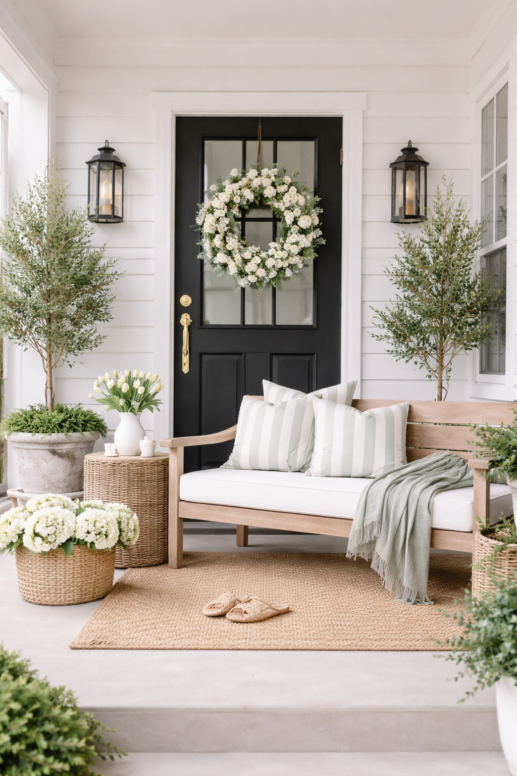
3) The 5-layer spring porch formula
This is the exact order designers style in. It prevents clutter and makes the porch feel intentionally layered— like a high-end magazine photo, not a seasonal display.
Base: rug or floor texture
Choose one grounded texture to “hold” the space. A too-small mat makes everything look temporary. Go slightly larger than you think, so it reads like a room, not a doorway.
Designer cue: light brown/ivory patterns, subtle stripes, jute blends, or a clean neutral weave.
Anchor: bench, chair, or planter (your main mass)
You need one “anchor” that provides scale. If your porch is small, the anchor can be a single statement planter (instead of furniture). If you have space, a bench or chair creates a lived-in feel.
Rule: one anchor first, then build around it—don’t start with accessories.
Vertical: wreath, lantern height, or a tree
Vertical elements make the porch feel “finished.” Choose one vertical statement: a simple wreath, a tall lantern, or a slender tree. This is the layer that photographs best for Pinterest.
Spring signal: greenery wreaths + light-toned planters read fresh without being floral-heavy.
Soft layers: pillows + one throw (keep it minimal)
Soft layers are where “season” shows up gently. Use one to two pillows and a relaxed throw in linen or a light weave. Avoid big patterns that overpower the calm palette.
Designer cue: one textured pillow + one simple solid. That’s it.
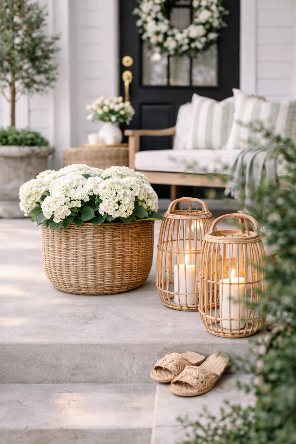
Finish: a small, intentional styling moment
Add one finishing detail: a small side table, a tray, or a single candle lantern moment. The secret is restraint—this is the “quiet luxury” layer.
Stop sign: if you’ve added three “small things,” remove two.
Editor Note
The difference between “pretty” and “designer” is editing. A porch should feel like a breath—open space is part of the design.
4) What to remove after winter (so spring can show up)
Spring styling isn’t always about adding. Often, the best “refresh” is what you take away. Use this as your edit list.
Remove / store
- Heavy plaid throws or dark, dense textiles
- Holiday or winter signage (even subtle ones)
- Too many mini décor pieces (they read clutter fast)
- Overly bright faux florals (save for later in spring)
- Anything cracked, faded, or “temporary” looking
Replace with
- One larger rug or woven base texture
- One strong planter (concrete/stone look)
- Simple greenery wreath
- Two calm pillows (texture + solid)
- One lantern moment for soft evening glow
Editor Notes: what actually makes it feel spring
The spring feeling is “lighter,” not “more”
The most expensive porches look effortless because they’re not crowded. Aim for lighter tones, simpler shapes, and fewer items—then let texture and greenery do the work.
The “one floral rule”
If you love florals, keep them to a single controlled place—like a wreath or one subtle pillow. Too many florals makes the porch feel themed instead of designed.
A designer’s spring checklist (quick scan)
Scale
One anchor that’s “real size.”
Texture
Woven base + linen softness.
Greenery
One spring signal, not a garden center.
Why this works (and why it looks expensive)
It’s timeless
This formula relies on proportion and texture—so it won’t look dated next season. You can refresh it by swapping only the spring signal (greenery, wreath, pillow cover).
It’s designed for real life
You get a beautiful porch that still functions: clear walkway, durable pieces, fewer items to move, and a look that stays clean (even when life is busy).
SOE Tip
This page is built to rank for spring porch ideas, spring front porch decor, and how to decorate porch for spring. Link to it from every related spring porch post as your “how-to pillar.”
FAQ
How do I make my porch feel like spring without using lots of flowers?
Focus on lighter textiles (ivory, linen), a woven base (jute/rug), and one greenery moment (wreath or planter). The “spring feeling” comes from brightness + texture + restraint—not from florals everywhere.
What’s the easiest spring porch update if I only have 10 minutes?
Swap the doormat/rug to something lighter and add a simple greenery wreath. Then remove any extra mini décor. Two changes + editing = a surprisingly big shift.
How many items should a small porch have?
Think in layers, not item count: one base texture, one anchor, one vertical, one soft layer, one small finishing moment. If it feels crowded, remove the smallest accessories first.
What porch rug size should I use?
Choose a size that visually “holds” the seating/anchor area. A rug that’s slightly larger than expected reads more expensive than a small mat. When in doubt, size up.
Can I mix black door elements with soft spring styling?
Yes—just soften the contrast with warm wood, brass, and ivory textiles. Keep greenery simple and avoid adding multiple bold patterns.