The Most Beautiful Kitchen Color Palettes Right Now
Kitchen Color Palettes · Organic Modern · Designer Kitchens
The Most Beautiful Kitchen Color Palettes Right Now
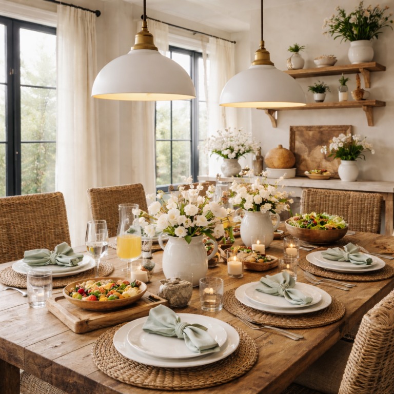
Kitchen color has the power to change the entire emotional feel of a home. It can make a kitchen feel soft and expensive, crisp and architectural, warm and welcoming, or flat and forgettable. The most beautiful kitchen color palettes right now are not just trendy combinations pulled from a paint deck. They are layered, livable palettes that create depth, calm, and elegance while still feeling current.
In the best kitchens, color works alongside material, lighting, texture, and styling. It gives cabinetry more richness, makes stone feel more dimensional, and helps every decorative choice look more intentional. This guide explores the kitchen color palettes designers are using right now, why they work so well, and how to choose one that will still feel elevated long after fast-moving trends fade.
Quick Answer
The most beautiful kitchen color palettes right now lean warmer, softer, and more layered than the cool gray kitchens of the past decade. Designers are favoring creamy whites, soft taupes, mushroom tones, muted greens, warm woods, stone-inspired neutrals, and tonal combinations that make kitchens feel calm, expensive, and timeless.
The best kitchen color combinations usually include three things: a dominant neutral, a grounding material tone such as wood or stone, and one subtle contrast color or finish that gives the room depth. When those elements work together, the kitchen feels designed rather than simply painted.
Key Takeaways
- Warm neutrals are replacing colder gray-heavy kitchen palettes.
- Beautiful kitchens use layered tones, not one flat color repeated everywhere.
- Wood, stone, metal, and textiles affect how kitchen color is perceived.
- Designer palettes usually balance softness, contrast, and material warmth.
- The most timeless kitchen colors still feel current because they are grounded in natural tones.
Quick Navigation
Why Kitchen Color Matters More Than Most People Think
Color is not just about paint. In a kitchen, color lives in the cabinetry, stone, backsplash, flooring, metal finishes, wood accents, stools, textiles, and styling. That means the palette influences the room at every level. It sets the mood before you even notice the layout. It changes how the light feels in the morning. It decides whether a kitchen reads as sharp and modern, warm and quiet, or dated and overly busy.
A well-chosen kitchen color palette also makes styling easier. When the foundation tones are cohesive, everyday objects like boards, bowls, canisters, linen towels, and island decor look better automatically. The whole room feels edited and intentional because the palette is doing part of the design work for you.
This is one reason color connects so strongly to the rest of your kitchen cluster. A palette influences whether organic modern kitchen ideas that feel warm and elevated truly feel warm, whether kitchen counter styling ideas that look designer photograph beautifully, and whether an island arrangement looks expensive or disconnected from the room.
The Most Beautiful Kitchen Color Palettes Right Now
The strongest kitchen palettes right now are not the cold, overly stark combinations that once dominated. Designers have shifted toward more warmth, more material richness, and more tonal variation. The following palettes feel especially current while still having the kind of timelessness that makes them worth living with for years.
Palette One
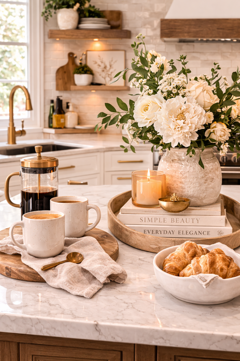
Creamy White + Warm Oak + Soft Stone
This is one of the most universally beautiful kitchen color palettes right now because it feels both classic and fresh. Creamy white cabinetry gives the room lightness without harshness. Warm oak adds depth and a natural grounding tone. Soft stone surfaces — especially those with subtle veining or variation — bring quiet luxury.
This palette works beautifully in homes that want an airy but warm feel. It also photographs exceptionally well for Pinterest because the contrast is soft and the material story is rich.
Palette Two
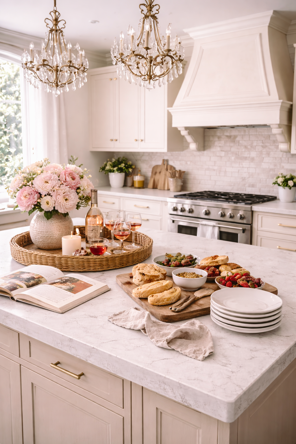
Mushroom Taupe + Marble + Aged Brass
Mushroom and taupe tones have become major designer favorites because they feel elevated, subtle, and a little moodier than plain off-white. Pairing them with marble or quartzite and warm brass accents creates a kitchen that feels polished, European-inspired, and quietly luxurious.
This is a particularly strong palette if you want a neutral kitchen that still has a little depth and softness. It also pairs naturally with the ideas in neutral kitchen decor ideas that feel luxurious.
Palette Three
Muted Sage + Warm White + Natural Wood
Muted greens continue to hold strong because they feel grounded in nature and bring color into the kitchen without overwhelming it. A soft sage or olive-leaning green, especially on cabinetry or an island, works beautifully with warm white walls and natural wood.
This palette feels especially beautiful in kitchens with lots of natural light, organic modern styling, or a softer European farmhouse influence.
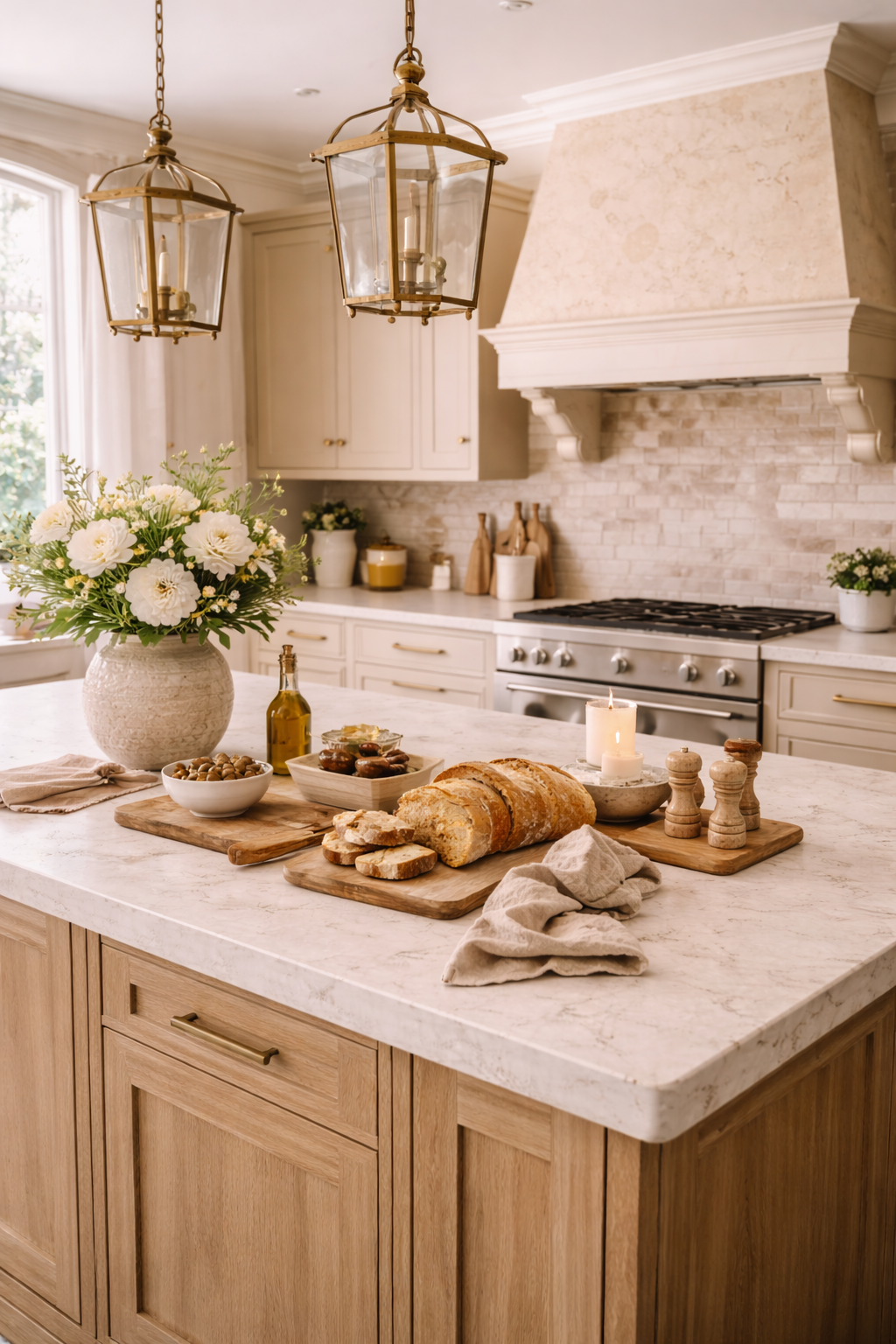
Palette Four
Soft Greige + White Oak + Travertine
Greige can still feel beautiful when it leans warm and is supported by tactile materials. White oak keeps the room from feeling flat, while travertine tones add softness and architectural depth. This palette is calm, tonal, and ideal for readers who want neutral kitchens that still feel current.
Palette Five
Deep Charcoal + Cream + Walnut
For kitchens that want more contrast and drama, a deep charcoal balanced with creamy undertones and walnut can feel incredibly sophisticated. The key is avoiding a cold black-and-white effect. This palette works best when the darker tones still have softness and the cream has warmth.
This palette tends to work especially well in kitchens with larger footprints, good natural light, and a slightly moodier luxury direction.
Palette Six
Buttercream + Sand + Light Wood
A very soft buttercream tone is becoming a beautiful alternative to plain white. It feels warmer, more gracious, and slightly more collected. Paired with sandy neutrals and light wood, it gives the kitchen a relaxed elegance that feels especially magazine-worthy.
How to Choose the Right Kitchen Color Palette for Your Home
A beautiful palette on Pinterest is not always the right palette for your home. The best kitchen color palette depends on your light, flooring, adjacent rooms, cabinet style, and the emotional tone you want the kitchen to carry. Before you choose a direction, it helps to ask a few questions.
Kitchen Color Selection Formula
| Question | Why It Matters |
|---|---|
| Does the room get warm or cool natural light? | Light changes how whites, taupes, greens, and grays read throughout the day. |
| What undertone is in the flooring? | The floor is a large visual base and can either support or fight your kitchen palette. |
| Do you want the kitchen to feel airy, grounded, or moody? | The palette should match the emotional tone you want from the room. |
| Are the adjacent rooms warm or cool? | Kitchens feel more expensive when they connect gracefully to the rest of the home. |
| Will your styling be minimal or layered? | Some palettes need more restraint while others can support more visible decor and texture. |
In other words, color should not be chosen in isolation. It should be chosen in relationship to material and mood. That is why palettes tend to feel more designer when they include cabinetry tone, countertop tone, wood tone, metal finish, and styling palette as one complete system.
Why Warm Neutral Kitchens Feel More Luxurious Right Now
Warm neutral kitchens have become so dominant because they solve a problem many homeowners felt in older gray-heavy kitchens: they bring back comfort. A kitchen can still be clean and modern while feeling softer, more grounded, and more livable. Warm neutrals achieve that balance beautifully.
Creamy whites, mushroom, taupe, oat, putty, sand, warm greige, and stone-inspired colors all make kitchens feel quieter and more expensive because they echo the colors found in natural materials. They let the room breathe. They also work especially well with wood, linen, travertine, marble, and brushed metal finishes.
These tones also support better styling. If you are using the ideas from the kitchen island styling formula designers use or kitchen counter styling ideas that look designer, warm neutral palettes make every bowl, tray, branch, and textile feel more cohesive and expensive.
Organic Modern Kitchen Color Ideas That Always Work
Organic modern kitchens rely heavily on palette because the style is defined by softness, natural materials, and calm contrast. The best organic modern kitchen color palettes usually include a warm dominant neutral, a wood tone, and one deeper grounding element.
Organic Modern Combination One
Warm White + Oak + Stone
This is the most classic organic modern direction and works in almost any home. It feels warm, elevated, and editorial without trying too hard.
Organic Modern Combination Two
Taupe + Walnut + Cream
A slightly moodier version of the look, ideal for kitchens that want more richness and a softer sense of contrast.
Organic Modern Combination Three
Soft Olive + Warm White + Travertine
Perfect for homeowners who want a touch of color without losing the calm, natural feel of the room.
Organic Modern Combination Four
Greige + Oak + Muted Brass
This combination feels understated and luxurious, especially in kitchens with layered textures and soft styling.
These palettes tie directly into organic modern kitchen ideas that feel warm and elevated, where color is never separate from material and styling.
How Material Changes the Way a Kitchen Color Palette Feels
Two kitchens can use the same wall or cabinet color and still feel completely different because the supporting materials are different. A creamy white kitchen with glossy synthetic finishes will never feel the same as a creamy white kitchen layered with oak, natural stone, linen, and matte ceramic.
This is why color planning has to include more than paint swatches. Wood can add warmth, stone can add movement, metal can shift the room more modern or more classic, and textiles soften the whole visual story. Materials change whether a palette reads rich or flat.
If your goal is a higher-end look, it helps to think in terms of palette plus texture, not palette alone. That is also why readers exploring luxury kitchen decor ideas that feel like a designer home often end up refining materials and styling at the same time as color.
Kitchen Color Palette Ideas for Builder Grade Kitchens
Builder grade kitchens often improve dramatically when the palette becomes warmer and more intentional. Many of these kitchens start with cold whites, builder gray, or disconnected finishes that make the room feel generic. Adjusting the palette can change the entire impression without requiring a full renovation.
Some of the best builder grade kitchen palette upgrades include:
- switching from stark white to creamy white
- bringing in warm wood through stools, boards, or shelving
- replacing cool gray accessories with taupe, stone, or oat tones
- adding brass or aged metal instead of bright chrome everywhere
- styling with ceramics and linens in a tighter palette
These small shifts work especially well with the ideas in how to make a builder grade kitchen look custom, where palette plays a major role in making the kitchen feel more tailored and less default.
Color Mistakes That Make Kitchens Look Cheap or Dated
Mistakes to Avoid
- Choosing colors without considering undertones. Warm and cool finishes can clash badly when they are not evaluated together.
- Using only one flat neutral. Kitchens need tonal layering or they risk feeling washed out and generic.
- Leaning too cold. Harsh whites and gray-heavy palettes can make kitchens feel sterile instead of sophisticated.
- Ignoring natural light. A paint color that looks beautiful online can turn muddy, icy, or yellow in the wrong lighting.
- Adding trend color without a material plan. Bold color alone rarely makes a kitchen feel designer if the finishes and styling do not support it.
- Forgetting how styling will sit in the palette. Bowls, boards, trays, and textiles should feel like part of the room’s color story.
Many of these issues overlap with the broader visual problems covered in kitchen styling mistakes that make a kitchen look cheap. A disconnected palette makes every other design problem more visible.
Designer Notes: Why the Best Kitchen Palettes Feel So Effortless
Designer Notes
The reason certain kitchen color palettes feel immediately “right” is that they do not rely on one note. They layer a main neutral with a grounding material and a softer contrast. That creates dimension without chaos. It also makes the room feel more like an environment and less like a set of isolated design decisions.
Beautiful kitchens usually feel effortless because the palette has already done so much of the work. The island styling feels better, the counters feel calmer, the backsplash looks richer, and the lighting feels softer because the colors belong together. The palette is carrying the room.
Designer Checklist for Choosing a Beautiful Kitchen Color Palette
Kitchen Color Checklist
- Choose a dominant neutral that matches the light in your room.
- Add a grounding material tone such as wood or stone.
- Make sure all undertones work together before committing.
- Use tonal variation so the kitchen does not feel flat.
- Think about cabinetry, backsplash, counters, hardware, and styling as one palette.
- Favor warmth if you want the kitchen to feel softer and more expensive.
- Test the palette at different times of day.
- Consider how the kitchen connects visually to adjacent rooms.
- Keep visible decor and everyday objects within the same color story.
- Edit out any finish that feels too bright, too cool, or too disconnected.
Related Kitchen Reads
Kitchen Color Palette FAQs
What kitchen color palettes are in style right now?
Warm neutrals, creamy whites, mushroom taupes, muted greens, soft greiges, warm wood tones, and stone-inspired palettes are some of the most beautiful and current kitchen color directions right now.
What kitchen colors look the most expensive?
Colors that feel layered and warm usually look the most expensive, especially creamy whites, taupes, mushroom tones, soft stone shades, muted olive, and charcoal balanced with cream and wood.
Are white kitchens still in style?
Yes, but the most current white kitchens tend to be warmer and softer than older stark-white versions. Creamy whites paired with wood, stone, and texture feel much more elevated right now.
What color kitchen cabinets are timeless?
Warm white, creamy off-white, soft taupe, muted greige, and natural wood tones are among the most timeless kitchen cabinet colors because they work with many styles and materials.
What is the best color palette for an organic modern kitchen?
Organic modern kitchens usually look best with warm white, oak, stone, taupe, muted olive, walnut, and other natural tones that create softness and quiet contrast.
How do I choose a kitchen color palette that will not feel dated?
Choose tones grounded in natural materials, pay attention to undertones, avoid extreme trend colors unless used sparingly, and create tonal layering instead of relying on one flat color.
Can kitchen styling affect how the color palette feels?
Yes. Boards, bowls, linens, canisters, greenery, and metal accents all reinforce or disrupt the kitchen’s palette. Styling is one of the easiest ways to make colors feel more cohesive and expensive.
Final Thoughts
The most beautiful kitchen color palettes right now feel layered, warm, and deeply livable. They are not chasing shock value. They are building atmosphere. Whether that atmosphere comes from creamy whites and oak, mushroom taupe and marble, or muted sage and warm stone, the goal is the same: a kitchen that feels elegant, calm, and worth lingering in.
The best palette for your kitchen will always be the one that works with your light, your home, and your materials while supporting the mood you want every day. Choose warmth over harshness, depth over flatness, and cohesion over trend-chasing. When the palette is right, the whole kitchen starts to feel more custom, more expensive, and more beautiful.
For the strongest cluster flow, continue with Neutral Kitchen Decor Ideas That Feel Luxurious and Organic Modern Kitchen Ideas That Feel Warm and Elevated.