How to Set a Formal Kitchen Table for Valentine’s Day
How to Set a Formal Kitchen Table for Valentine’s Day
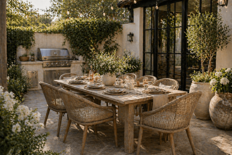
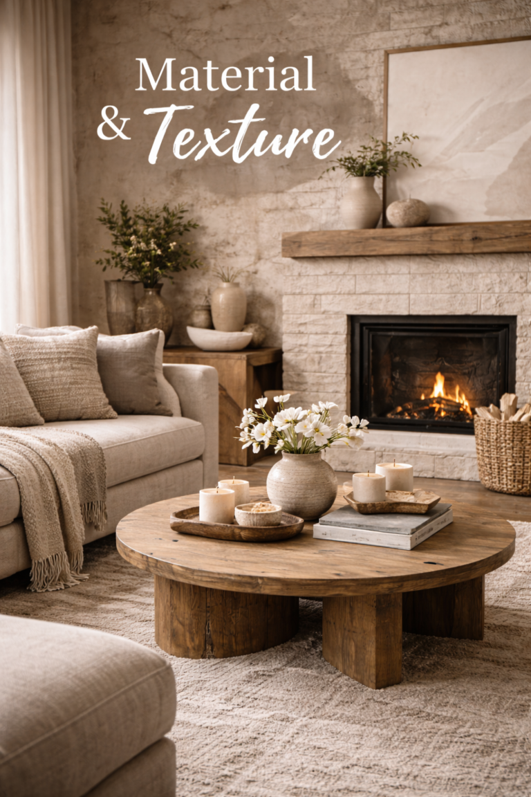
An Organic Modern, Designer-Approved Approach
What makes a formal kitchen table feel truly high-end?
The most elevated Valentine’s tables are not themed—they’re designed. Think: natural materials, restrained color, intentional repetition, and candlelight that feels architectural rather than decorative.
The 10-minute formal table blueprint
If you do nothing else, follow this sequence. It delivers a “finished” look quickly, then you refine.
1) Base layer
Runner or placemats in linen / flax / woven. Keep the table surface visible.
2) Repeat the place setting
Plate + charger (or placemat), cloth napkin, consistent flatware + glassware.
3) Candlelight + centerpiece
Low + layered. Candlelight is your romance; the centerpiece is your sculpture.
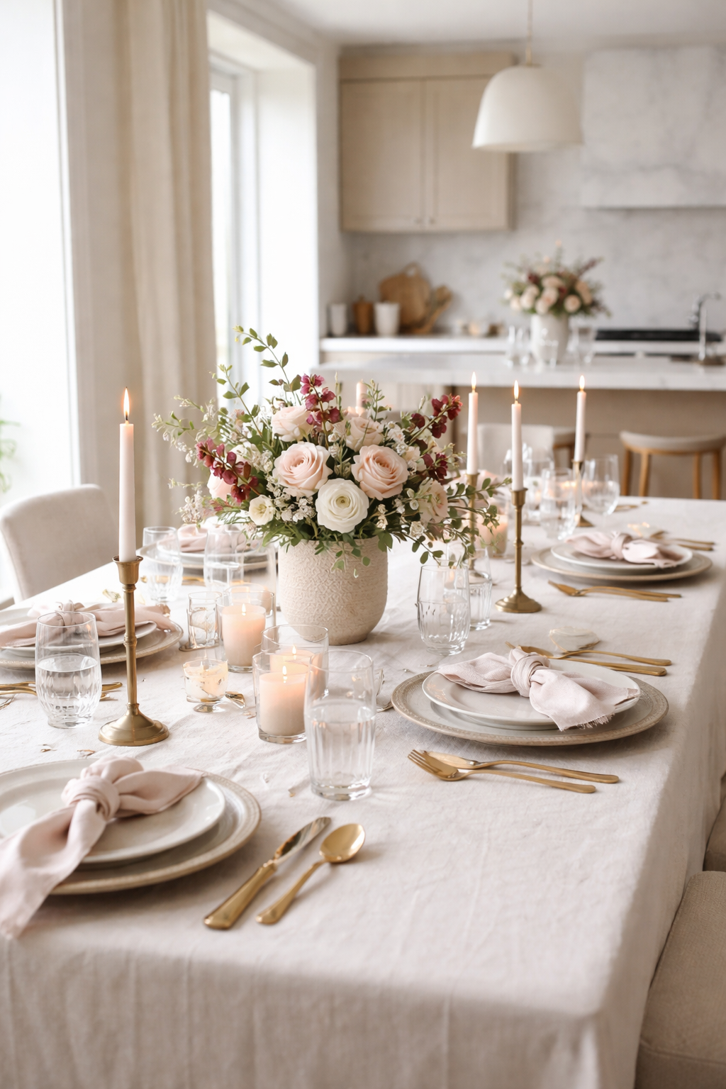
Color palette & material recipe for an organic modern Valentine’s table
The most luxurious Valentine’s tables rely on texture and tone, not bold holiday colors. Use blush as a whisper, not a headline.
| Layer | Best tones | Materials that read “luxury” | Valentine’s cue (subtle) |
|---|---|---|---|
| Textiles | Flax, ivory, warm beige | Linen runner, soft cotton napkins | Blush napkin, tonal ribbon, soft rose detail |
| Tableware | White, cream, stone | Stoneware / porcelain with matte finish | Scalloped edge or subtle gold rim (minimal) |
| Metals | Champagne brass | Brushed brass flatware + candlesticks | Warm glow (not shiny, not mirrored) |
| Glass | Clear, lightly fluted | Crystal-style stemware + low water glasses | Candlelight reflections (soft, not glittery) |
SOE keywords naturally supported here: formal table setting, Valentine’s Day table, organic modern décor, luxury place settings, candlelight tablescape.
Step-by-step: how to set a formal kitchen table for Valentine’s Day
This sequence is designed for real kitchens and real time constraints—without sacrificing the finished look.
Lay your foundation (runner or placemats)
Choose a linen runner for a streamlined, modern base—or woven placemats for structured texture. Keep at least 30–40% of the table surface visible.
Build the plate stack
Formal doesn’t require extra plates—just consistency. Start with a charger (or placemat), then a dinner plate. Add a salad plate only if you’re serving courses.
Add flatware with one metal tone
Choose brushed gold/champagne for Valentine’s warmth. Align flatware so it feels intentional: knife blade facing inward, forks evenly spaced, dessert spoon above only if needed.
Use cloth napkins for softness
Avoid overly fussy folds. A loose knot, soft ring, or gentle drape reads more modern and expensive. If you want a Valentine’s cue, use blush napkins or a tonal ribbon—nothing novelty.
Set glassware intentionally
For a formal feel: water glass + wine glass (or flute). Keep spacing consistent. Fluted glass adds depth without visual noise.
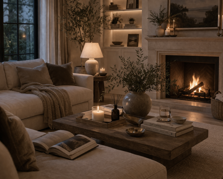
Finish with candlelight + a sculptural centerpiece
Layer tapers and low votives. Keep the centerpiece low enough for conversation. The goal is mood, not height.
Proportions & spacing that instantly look “designer”
These are the small details people can’t name, but always feel.
| Element | Designer spacing guideline | Why it looks high-end |
|---|---|---|
| Place settings | Leave ~2–3 inches between charger edges | Creates rhythm and breathing room |
| Candles | Keep most flames below eye level when seated | Conversation-friendly, less cluttered |
| Runner | Centered with visible table edges on both sides | Feels tailored, not busy |
| Centerpiece | One main “anchor,” then smaller supporting pieces | Looks curated instead of scattered |
Centerpiece ideas that feel romantic (not cliché)
A Valentine’s centerpiece can be soft and romantic without hearts, signage, or bright red everything. Choose one of these approaches based on your room and time.
Option A: Low floral in ceramic
Cream + blush blooms in a matte vessel. Keep it low and slightly loose.
Option B: Candles as sculpture
Mixed heights in matching brass holders + a few low votives for glow.
Option C: Branches for architecture
Minimal branches in a stone vase—modern, dramatic, and long-lasting.
Common mistakes that make a table feel less expensive
- Too many colors: keep it to neutrals + one soft accent (blush or warm brass).
- Centerpiece too tall: it becomes décor, not a dining experience.
- Inconsistent metals: mixed shiny metals can read busy—choose one and repeat it.
- Over-themed Valentine’s décor: novelty items date the table instantly.
- Clutter per place setting: formal is about alignment and calm, not quantity.
Mini quiz: what’s your Valentine’s table style?
Pick the answer you naturally prefer. Your result tells you which centerpiece option will look best in your home.
1) Your dream table feels…
- A) Soft + romantic
- B) Clean + minimal
- C) Moody + dramatic
2) Your home leans…
- A) Light neutrals + cozy textures
- B) Modern lines + calm spaces
- C) Classic pieces + deep tones
Frequently asked questions
Can a kitchen table look formal enough for Valentine’s Day?
Yes—especially with linen, consistent place settings, and candlelight. Kitchens often provide better lighting and feel more intimate than a separate dining room.
Do I need a tablecloth for a formal table setting?
Not necessarily. A linen runner or structured placemats can look more modern and expensive while still reading formal. The key is quality textile + alignment.
How do I make it romantic without using red décor?
Use candlelight, warm metals (champagne brass), and a soft tonal accent like blush or ivory. Romance comes from mood, not novelty décor.
How can I keep the centerpiece from blocking conversation?
Keep the main arrangement low and wide or use candles as sculpture. If you want height, move taller pieces to a nearby console so the table remains functional.
Tip: This FAQ is also marked up below with FAQ schema for stronger search visibility.