The Kitchen Styling Formula That Makes Any Kitchen Look Expensive
Kitchen Styling Formula · Expensive-Looking Kitchen · Designer Method
The Kitchen Styling Formula That Makes Any Kitchen Look Expensive
Some kitchens look expensive the moment you walk in, even when the cabinetry is simple and the renovation budget was not unlimited. Others have good finishes on paper but still feel flat, cluttered, or oddly unfinished. The difference usually comes down to styling. Not decorative excess, but styling in the true designer sense: the way the palette, materials, lighting, surfaces, and visible objects work together to create a room that feels warm, composed, and elevated.
This guide breaks down the exact kitchen styling formula that makes any kitchen look more expensive. It is not a gimmick and it is not trend-driven. It is a practical, repeatable framework designers use to make kitchens feel more custom, more luxurious, and more beautiful to live in. Whether your kitchen is builder grade, organic modern, neutral, or somewhere in between, this formula helps the room feel calmer, richer, and far more intentional.
Quick Answer
The kitchen styling formula that makes any kitchen look expensive is simple: start with a warm cohesive palette, add natural materials with texture, create one strong focal surface, upgrade visible everyday objects, style only a few zones with scale and restraint, and let negative space do part of the work. Expensive kitchens feel composed, not crowded.
In practice, that means warm woods, stone, ceramic, linen, and quiet metals; one styled island arrangement; one or two thoughtful counter zones; better lighting; and a consistent visual story across the room. The kitchen should feel intentionally edited from every angle.
Key Takeaways
- Expensive-looking kitchens rely on cohesion more than decoration.
- Warm materials and soft tonal palettes almost always feel richer than cold or overly busy ones.
- Fewer but stronger styling moments create more impact than decorating every surface.
- Visible daily-use items affect the quality of the room more than most people realize.
- Lighting, scale, and negative space are essential parts of the formula.
Quick Navigation
- Why This Kitchen Styling Formula Works
- Step 1: Start With a Warm Cohesive Palette
- Step 2: Use Better Materials
- Step 3: Make the Island the Focal Point
- Step 4: Style the Counters in Zones
- Step 5: Upgrade Visible Everyday Objects
- Step 6: Use Lighting to Soften the Room
- Step 7: Edit Ruthlessly
- Mistakes That Break the Formula
- Designer Checklist
- Kitchen Styling Formula FAQs
Why This Kitchen Styling Formula Works So Well
Expensive-looking kitchens share certain visual traits no matter what style they fall into. They usually feel calm. They use a narrower range of better materials. They have one or two strong focal points. The decor has enough scale to stand up to the room. And there is enough empty space for the eye to rest. This formula simply organizes those principles into something you can apply intentionally.
The reason it works is that kitchens are already visually active rooms. Cabinets, stone, appliances, hardware, outlets, lighting, and stools all create information. That means kitchens do not need more visual noise. They need better hierarchy. When the room has a clear palette, better materials, stronger focal styling, and fewer weak distractions, it naturally reads as more expensive.
This is also why the formula works across styles. A warm organic modern kitchen, a transitional neutral kitchen, and a slightly moodier luxury kitchen can all use the same underlying logic. The details change, but the structure remains the same: cohesion, warmth, restraint, scale, and material depth.
Step 1: Start With a Warm Cohesive Palette
Formula Step One
The palette is the foundation of everything else. If the color story is cold, disconnected, or overly busy, the kitchen will struggle to feel expensive no matter how nice the decor is. Warm, layered palettes create instant softness and richness.
The best kitchens usually rely on a dominant neutral, a grounding material tone, and one subtle contrast or accent finish. That might mean creamy white cabinetry, oak stools, and stone counters. Or taupe cabinets, brushed brass, and marble. Or charcoal balanced with walnut and warm whites. Whatever the palette, the tones need to relate to one another.
This is why articles like the most beautiful kitchen color palettes right now and neutral kitchen decor ideas that feel luxurious matter so much inside the cluster. Expensive kitchen styling starts with the color environment the styling has to live inside.
Warm whites, creamy neutrals, mushroom tones, taupe, soft stone, muted olive, oak, walnut, and brushed metal finishes usually create a more elevated mood than icy whites, cold grays, and too many high-contrast colors fighting for attention.
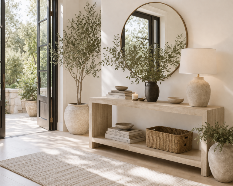
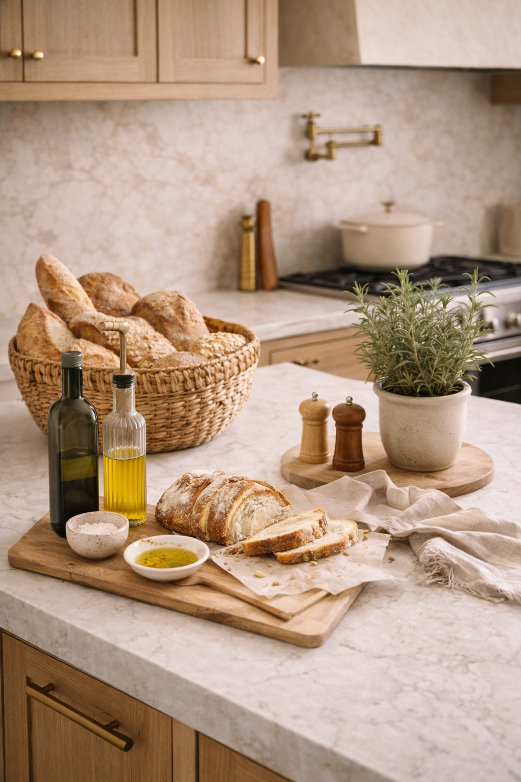
Step 2: Use Better Materials, Not More Decor
Formula Step Two
Luxury is often a material story before it is a decor story. Kitchens look more expensive when the visible objects feel tactile, weighty, and honest.
Wood
Adds warmth
Boards, trays, stools, and utensils in warm wood soften stone and painted cabinetry immediately.
Stone
Adds architecture
Stone bowls, trays, marble details, and natural surfaces bring depth and a quiet sense of permanence.
Ceramic + Linen
Add softness
Matte ceramics and neutral textiles make a kitchen feel more collected and less manufactured.
Kitchens start to look cheaper when too many items are plastic, overly shiny, or obviously temporary. Even simple upgrades matter here. A ceramic utensil crock feels different from a basic container. A glass soap bottle feels different from bright branded packaging. A heavy wood board or stone bowl looks more substantial than a cluster of small decorative pieces.
This is a big reason luxury kitchen decor ideas that feel like a designer home tend to emphasize material quality over quantity. Better objects usually outperform more objects.
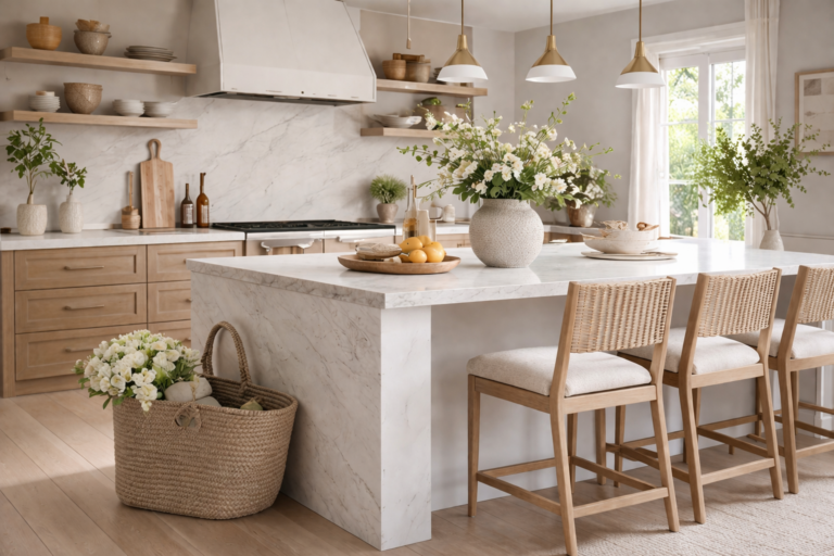
Step 3: Make the Island the Main Focal Point
Formula Step Three
Most kitchens need one main styling hero, and in many cases that hero should be the island. When the island is styled well, the entire room feels more finished and more intentional.
Expensive-looking islands are almost never covered in many random things. They use one composed arrangement with enough scale and visual weight to hold the surface. That might be a stone bowl, a short stack of books, a sculptural vase, greenery, or a tray that gathers the grouping into one clear moment.
Expensive-Looking Island Formula
| Layer | Purpose | Examples |
|---|---|---|
| Anchor piece | Creates presence | Travertine bowl, ceramic vessel, wood tray |
| Grounding layer | Adds structure | Cookbooks, folded linen, board |
| Softening element | Adds movement | Olive branches, fruit, greenery |
| Negative space | Keeps it expensive | Open island surface around the arrangement |
This is exactly why the kitchen island styling formula designers use is such an important cluster page. The island sets the tone for the entire kitchen, especially in open-concept homes.
Step 4: Style the Counters in Clear, Beautiful Zones
Formula Step Four
Expensive kitchens do not decorate every inch of countertop. They create a few intentional zones and let the rest of the surface breathe.
The most effective zones are usually near the sink, the range, or a coffee station. The sink zone may only need a tray, a soap bottle, and a folded towel. The cooking zone might use a board, utensil crock, salt cellar, and oil bottle. A coffee station may use a tray, mugs, a canister, and one soft styling element. The common trait is restraint.
Counters that are fully covered with decor and appliances tend to feel visually heavy. Counters with one or two thoughtful vignettes and open surface area feel expensive and much more designer-level. This is why kitchen counter styling ideas that look designer are central to the full formula.
Step 5: Upgrade the Everyday Objects That Stay Visible
Formula Step Five
The visible utility pieces in a kitchen do a huge amount of visual work. If they look cheap, the kitchen looks cheaper. If they look beautiful, the room feels more elevated immediately.
Think about what is always out: soap, utensil holders, cutting boards, bowls, canisters, trays, oils, towels, mugs, coffee tools, and fruit. These are not secondary to the styling. In a real kitchen, they are the styling. Upgrading them is often the fastest way to improve the room.
This is especially important in more standard kitchens. Articles like how to make a builder grade kitchen look custom work so well because they show how much impact better visible objects and finish choices can have without changing the entire layout.
Cheap-Looking Version
Bright packaging + random tools
Loose soap bottles, plastic containers, mismatched jars, and cluttered accessories make the room feel generic fast.
Expensive-Looking Version
Contained, tonal, and tactile
A tray, stoneware bottle, linen towel, wood board, and ceramic container create calm, warmth, and cohesion.
Step 6: Use Lighting to Soften, Flatter, and Elevate the Room
Formula Step Six
Lighting is part of the styling formula because it changes how every finish, texture, and color in the kitchen reads.
Harsh cool lighting can flatten wood, make whites feel stark, and exaggerate clutter. Warm flattering lighting, by contrast, helps the room feel softer and more layered. The best kitchens often combine beautiful pendants, warmer bulbs, and sometimes under-cabinet lighting or softer side-light moments to avoid that harsh, overly bright effect.
Scale matters here too. Undersized pendants can make the island feel less intentional. Better fixture size and better light temperature usually make the whole kitchen feel more custom immediately.
Step 7: Edit Ruthlessly and Leave Negative Space
Formula Step Seven
The final and most overlooked part of the formula is editing. Expensive kitchens do not feel expensive because everything has been added. They feel expensive because the wrong things have been removed.
Negative space is one of the strongest luxury signals in a kitchen. Open island surface, calm counters, clear sightlines, and styling with breathing room all make the room feel more architectural and more refined. Many kitchens improve dramatically when one or two extra items are removed from every visible surface.
This is where the formula intersects so clearly with kitchen styling mistakes that make a kitchen look cheap. Cheap-looking kitchens tend to be overfilled, visually noisy, or disconnected. Expensive-looking kitchens are controlled, cohesive, and calm.
How This Formula Works in Organic Modern Kitchens
Organic modern kitchens often respond especially well to this formula because the style already values warm neutrals, natural materials, and soft restraint. In these kitchens, the formula becomes about layering oak, walnut, stone, ceramic, linen, and greenery in a calm way while keeping the surfaces edited.
That is why organic modern kitchen ideas that feel warm and elevated fit so naturally here. The design language is already aligned with what makes kitchens feel more luxurious: texture, warmth, balance, and material honesty.
How This Formula Works in Builder Grade Kitchens
The formula is just as powerful in builder grade kitchens, perhaps even more so. When cabinetry and base finishes are standard, styling has a greater job to do. Better hardware, better lighting, warmer palette decisions, upgraded everyday objects, and stronger island and counter styling can all make a builder grade kitchen feel dramatically more custom.
The key is not trying to disguise everything with more decor. It is strengthening the materials and editing the room until the standard elements feel better supported.
Mistakes That Break the Kitchen Styling Formula
Mistakes to Avoid
- Decorating every surface. Too much styling reduces the sense of luxury and calm immediately.
- Using many small decorative items. Kitchens need scale, not filler.
- Keeping bright packaging visible. This breaks the palette and weakens the room fast.
- Ignoring undertones. Warm and cool finishes fighting each other make kitchens feel less expensive.
- Styling the island and counters the same way. The island should usually be the hero and the counters the support.
- Using poor lighting. Harsh cool light flattens everything.
- Forgetting function. Expensive kitchens still feel easy to live in.
Designer Notes: Why This Formula Feels Timeless
Designer Notes
The reason this kitchen styling formula holds up over time is that it is built on principles, not trends. Cohesion, warmth, scale, restraint, material depth, and negative space are not things that go out of style. They are the visual foundations of rooms that feel beautiful and considered.
Trends may influence whether the palette leans creamier, moodier, or greener in a given year, but the underlying formula stays the same. When a kitchen has one strong focal point, better materials, calm counters, flattering light, and a disciplined palette, it almost always reads as more expensive.
Designer Checklist for Making Any Kitchen Look More Expensive
Kitchen Styling Checklist
- Choose a warm, cohesive color and material palette.
- Bring in natural materials like wood, stone, ceramic, linen, and warm metal.
- Style the island as one strong focal arrangement.
- Create only one or two thoughtful counter zones.
- Upgrade visible utility items so they contribute to the room.
- Use fewer pieces, but make them more substantial.
- Check lighting temperature and fixture scale.
- Let negative space remain part of the design.
- Make sure everything visible feels like it belongs to the same story.
- Edit one more time before calling the kitchen finished.
Related Kitchen Reads
Kitchen Styling Formula FAQs
How do you make a kitchen look more expensive?
Use a warm cohesive palette, better natural materials, one strong island arrangement, a few edited counter zones, upgraded visible utility items, flattering lighting, and enough negative space to keep the room calm and intentional.
What is the best kitchen styling formula?
The best kitchen styling formula combines palette, material quality, focal-point styling, better visible daily-use objects, warm lighting, and restraint. It is less about adding more decor and more about creating a room where every visible choice feels cohesive.
What makes a kitchen look cheap instead of expensive?
Too much clutter, small filler decor, bright packaging, cold lighting, disconnected finishes, and styling every surface usually make a kitchen look cheaper. Expensive kitchens feel edited and balanced.
Should I decorate every kitchen counter?
No. Expensive-looking kitchens usually style only one or two clear counter zones and leave the rest open enough to feel clean, functional, and calm.
How should I style a kitchen island to look expensive?
Use one composed arrangement with an anchor piece, a grounding detail such as books or a tray, and one organic layer like fruit or greenery, then leave enough open space around it.
Can this formula work in a builder grade kitchen?
Yes. This formula is especially helpful in builder grade kitchens because better lighting, upgraded visible objects, stronger styling, and a warmer palette can make standard finishes feel far more custom.
What materials make a kitchen feel more luxurious?
Wood, stone, ceramic, linen, and warm metal finishes are some of the strongest materials for making a kitchen feel more luxurious, layered, and high-end.
Final Thoughts
The kitchen styling formula that makes any kitchen look expensive is not complicated once you see how the pieces fit together. Warm cohesive palette. Better materials. One strong island moment. Thoughtful counter zones. Upgraded everyday objects. Softer lighting. Ruthless editing. That combination creates kitchens that feel calmer, more custom, and more beautiful to live in every day.
The best part is that this formula is flexible. It works in large kitchens and small kitchens, in new builds and older homes, in builder grade kitchens and more custom spaces. It does not ask you to buy more. It asks you to style better. Once the room feels intentional from every visible surface, the whole kitchen starts to read as more expensive.
For the strongest cluster flow, continue with Designer Kitchen Styling Tricks That Instantly Make a Kitchen Look Expensive and Kitchen Counter Styling Ideas That Look Designer.