Kitchen Styling Mistakes That Make a Kitchen Look Cheap
Kitchen Styling · Decor Mistakes · Designer Fixes
Kitchen Styling Mistakes That Make a Kitchen Look Cheap
A kitchen rarely looks cheap because of one catastrophic choice. More often, it happens through a series of small styling mistakes that quietly lower the overall feel of the room. Counters get too cluttered. The decor is too small. The palette feels disconnected. Utility items stay in bright packaging. The island is either completely bare or overloaded. Lighting feels harsh. None of those details seem dramatic on their own, but together they make a kitchen feel less refined, less intentional, and far less expensive than it could.
The encouraging part is that these mistakes are fixable. In many kitchens, the difference between cheap-looking and designer-looking has more to do with editing, scale, materials, and cohesion than with a full renovation. This guide breaks down the most common kitchen styling mistakes, why they weaken the look of a space, and the exact designer fixes that make a kitchen feel more elevated immediately.
Quick Answer
The kitchen styling mistakes that make a kitchen look cheap usually come down to clutter, poor scale, disconnected finishes, harsh lighting, and styling that ignores how the room is actually used. Beautiful kitchens feel calm and intentional. Cheap-looking kitchens tend to feel random.
The fastest fixes are to remove excess decor, upgrade visible everyday items, create fewer but stronger styling moments, simplify the palette, and use natural materials like wood, stone, ceramic, linen, and warm metal finishes.
Key Takeaways
- Too many small objects instantly make kitchen styling feel cluttered and lower-end.
- Visible plastic packaging and mismatched daily-use items undermine even beautiful kitchens.
- Scale matters more than most people think on counters and islands.
- Warm, cohesive palettes and natural materials make kitchens feel more expensive.
- Editing is often the most powerful designer move in the room.
Quick Navigation
- Why Some Kitchens Look Cheap Even With Good Finishes
- The Biggest Kitchen Styling Mistakes
- Countertop Styling Mistakes
- Kitchen Island Styling Mistakes
- Color and Material Mistakes
- Lighting Mistakes That Hurt the Look
- Designer Fixes That Instantly Elevate a Kitchen
- Kitchen Styling Checklist
- Kitchen Styling FAQs
Why Some Kitchens Look Cheap Even With Good Finishes
A kitchen can have decent cabinetry, solid counters, and a functional layout and still feel surprisingly low-end. The reason is that visual quality is not created by architecture alone. It is created by the relationship between surfaces, lighting, materials, and styling. When those elements are out of balance, the room feels less refined no matter how much money was spent on the base construction.
That is why beautiful kitchens often feel elevated in a way that is hard to define at first glance. Their surfaces breathe. The styling is edited. The palette feels connected. Functional items have been upgraded. There is enough warmth to soften the harder materials in the room. The overall impression is calm.
By contrast, kitchens that look cheap often feel visually busy. There may be too many small decor items, too many finishes, too much packaging left visible, or styling that has no connection to the palette or architecture. The kitchen does not need more personality. It needs more coherence.
The Biggest Kitchen Styling Mistakes Designers Notice Immediately
Designers tend to spot the same problems over and over again. They are not necessarily dramatic. They are the quiet, repeated choices that make a kitchen feel cluttered, generic, or unfinished.
The Biggest Offenders
| Mistake | Why It Hurts the Room | Designer Fix |
|---|---|---|
| Too many small decor items | Creates visual noise and makes the kitchen feel fussy | Use fewer pieces with more scale and presence |
| Bright branded packaging | Breaks the palette and cheapens the counters instantly | Decant essentials into glass, ceramic, or stoneware containers |
| Cold or disconnected palette | Makes the room feel sterile or generic | Shift toward warmer neutrals and repeated material tones |
| Overdecorated counters | Reduces function and makes styling feel forced | Create only one or two intentional counter zones |
| Island styled with random objects | Makes the largest surface feel messy instead of composed | Use one strong arrangement with clear hierarchy |
| Harsh lighting | Flattens texture and exaggerates every weak finish | Use warmer bulbs and better fixture scale |
Many of these problems are the reverse of what works in designer kitchen styling tricks that instantly make a kitchen look expensive. Expensive-looking kitchens do not feel fuller. They feel more edited and more intentional.
Mistake 1: Too Many Small Decorative Objects
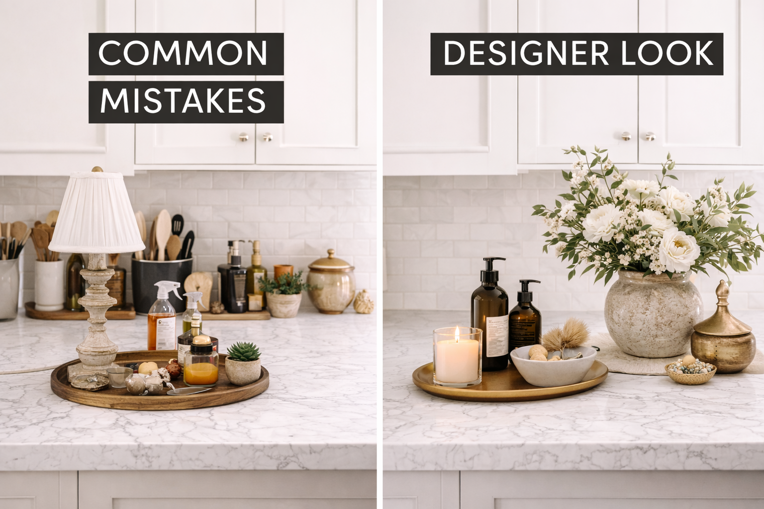
Tiny decor is one of the fastest ways to make a kitchen look less expensive. Multiple mini signs, small faux plants, little word plaques, or clusters of decorative pieces spread across the counters make the space feel busy and fragmented. Kitchens need stronger shapes and cleaner styling.
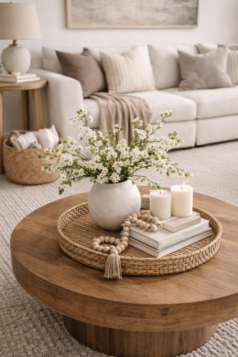
A much better approach is to use a few larger objects with visual weight. A wooden board, a ceramic bowl, one vase of branches, or a sculptural tray does more for a kitchen than a dozen small accessories. Larger pieces stand up to cabinetry, counters, and backsplash better, so the room feels more balanced.
Mistake 2: Leaving Utility Items in Cheap Packaging
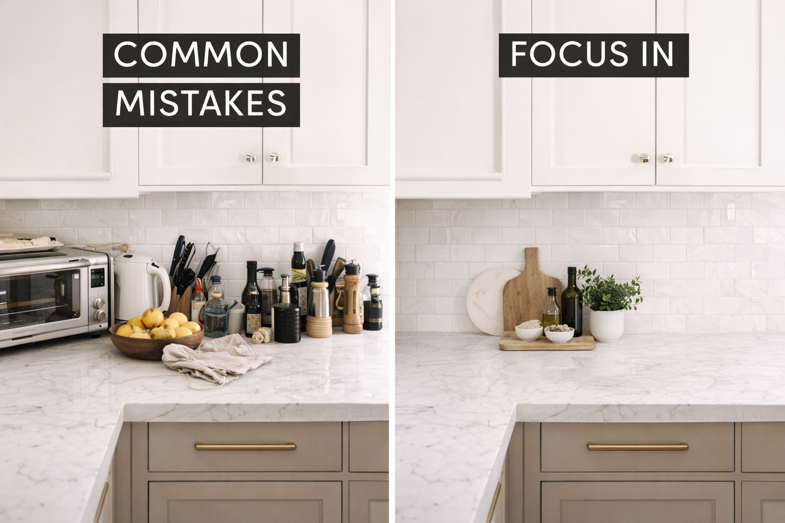
Soap bottles, dish pods, sponges, paper towels, food boxes, and plastic oil containers all have a visual impact. When they stay visible in bright branded packaging, they disrupt even the best color palette. They also make the kitchen feel more like a utility zone than a beautifully designed part of the home.
One of the easiest upgrades is to decant where it matters most. A beautiful soap bottle at the sink, a ceramic crock for utensils, a glass bottle for olive oil, and a tray to contain daily-use items can completely change how the counters read. This is a major reason kitchen counter styling ideas that look designer often start with improving functional pieces, not adding decorative ones.
Mistake 3: Styling Every Inch of Counter Space
A common mistake is treating all empty countertop space as an opportunity for decor. In reality, empty space is one of the things that makes a kitchen feel expensive. Counters that are fully covered with boards, canisters, decor, appliances, and small accessories feel crowded and visually heavy.
Designers usually style only one or two clear zones. A refined sink vignette, a cooking zone near the range, and possibly a coffee station if the kitchen layout supports it. The rest of the counter gets to remain open. That negative space is part of the design.
Designer Fix
Instead of decorating every stretch of counter, choose one anchor area and one support area. Group items on trays, use pieces with scale, and leave the rest of the surface calm. The room will feel more breathable immediately.
Mistake 4: Using the Wrong Scale on a Kitchen Island
Kitchen islands are large surfaces, so they reveal scale problems fast. A couple of tiny decorative items on a large island usually look lost. On the other hand, too many objects lined down the center make the island feel cluttered and reduce function.
The best island styling uses one strong arrangement that feels proportional to the island itself. A bowl, a stack of books, a branch arrangement, or a tray with layered pieces creates a composed focal point. This is exactly why the kitchen island styling formula designers use is so effective: it gives the surface hierarchy instead of randomness.
Mistake 5: Mixing Too Many Finishes and Materials
A kitchen starts to feel less polished when too many unrelated finishes compete at once. Bright chrome, shiny black, cool gray, yellow-toned wood, artificial marble, and brushed brass can all be individually attractive, but when they are not coordinated thoughtfully, the room loses cohesion.
High-end kitchens usually repeat a tighter material story. They lean into warm woods, stone, matte ceramic, linen, subtle metal finishes, and tonal variation rather than constant contrast. This is why palettes explored in the most beautiful kitchen color palettes right now and neutral kitchen decor ideas that feel luxurious feel more expensive: the materials and tones are working together.
Mistake 6: Going Too Cold With the Color Palette
Cold kitchens often feel cheaper than warm kitchens, even when the finishes are technically good. Stark white, icy gray, or overly cool undertones can flatten the room and make it feel sterile. This is especially true under harsh artificial lighting.
Warmer whites, creams, soft taupes, mushroom tones, oak, walnut, stone, and muted greens tend to create a richer and more inviting effect. Warm palettes soften the architecture and make styling easier because boards, ceramics, linens, and greenery all sit more naturally within the space.
Mistake 7: Relying on Trend Decor Instead of Timeless Styling
Kitchens can quickly feel cheap when the decor relies too heavily on novelty. Overly themed seasonal pieces, word art, mini signs, trendy gadgets left on display, or hyper-specific trend decor often date the room faster than people expect. The kitchen starts to feel styled for a moment rather than designed for daily life.
The better move is to invest in timeless elements: boards, bowls, ceramic vessels, linen towels, trays, branches, fruit, and a restrained palette. These pieces feel beautiful year-round and still allow subtle seasonal shifts.
Mistake 8: Harsh Overhead Lighting That Flattens Everything
Lighting changes how every finish in the kitchen reads. Harsh cool bulbs can make whites look stark, woods look less rich, and stone look flatter. They also emphasize visual clutter. When the lighting feels cold or overly bright, even decent styling can feel less luxurious.
Warmer bulbs, better pendant scale, layered lighting, and under-cabinet lighting can all make a kitchen feel softer and more expensive. In many spaces, lighting is one of the highest-impact fixes for a cheap-looking kitchen because it changes the entire mood of the room at once.
Mistake 9: Styling Without Considering the Kitchen’s Actual Use
A beautiful kitchen still has to function. Styling that constantly needs to be moved, blocks prep areas, or interrupts traffic flow ends up feeling forced. The room may look good for a moment, but it does not feel believable or livable.
Designers style around the way the kitchen works. Sink areas stay practical. Cooking zones remain useful. Islands keep enough open space. Even beautiful arrangements tend to be easy to move or simple to live around. Kitchens look more expensive when they feel effortless, not precious.
Designer Fixes That Instantly Make a Kitchen Look More Expensive
The good news is that the opposite of cheap-looking kitchen styling is not complicated. It is usually a return to strong basics: fewer pieces, better materials, warmer tones, and clearer visual hierarchy.
Fix One
Edit aggressively
Remove weak decor, duplicate items, and anything too small to hold its own visually.
Fix Two
Upgrade daily-use pieces
Better soap bottles, trays, canisters, boards, bowls, and utensil containers go further than more decor.
Fix Three
Simplify the palette
Keep visible styling within a warm, cohesive range so the room feels intentional from every angle.
These fixes align naturally with the kitchen styling formula that makes any kitchen look expensive, where the overall goal is calm layering, not visual excess.
Cheap-Looking Kitchen vs Designer-Looking Kitchen
| Cheap-Looking Kitchen | Designer-Looking Kitchen |
|---|---|
| Many small accessories | Fewer, more substantial pieces |
| Bright packaging left visible | Upgraded containers and trays |
| Cold disconnected palette | Warm layered tones and natural materials |
| Counters fully covered | Open surface area and clear zones |
| Random island decor | One composed island arrangement |
| Harsh lighting | Softer warm lighting and better fixture scale |
How to Avoid Cheap-Looking Kitchen Styling in Builder Grade Spaces
Builder grade kitchens are especially vulnerable to styling mistakes because the base finishes often need more help to feel elevated. When counters are cluttered, the pendants are weak, and the palette is cold, the kitchen reads even more generic. But the reverse is also true: thoughtful styling can dramatically improve a builder grade kitchen.
That is why this topic connects so strongly to how to make a builder grade kitchen look custom. Better styling can add warmth, softness, and visual hierarchy without changing the full layout or cabinet structure.
Designer Notes: Why Editing Matters So Much in Kitchens
Designer Notes
Kitchens contain many hard-working objects by nature. Appliances, outlets, faucets, hardware, stone, storage, and utensils all create visual activity. That means the room does not need much additional noise. It needs softness and clarity.
This is why editing is such a designer move in kitchens. The room already has enough going on architecturally. Removing the wrong things often creates more beauty than adding the right ones. Once the visual noise drops, the better materials and stronger styling moments finally have room to shine.
Kitchen Styling Checklist to Avoid a Cheap Look
Quick Styling Checklist
- Remove small decorative clutter from counters and shelves.
- Keep only one or two styled zones on the perimeter counters.
- Use trays to contain daily-use items near the sink or coffee area.
- Replace bright packaging with glass, ceramic, or stoneware containers.
- Use larger decor pieces with stronger presence on the island and counters.
- Stick to a warm, cohesive palette.
- Repeat wood, stone, linen, ceramic, or metal finishes gently across the kitchen.
- Check the room under warm, flattering lighting rather than harsh cool bulbs.
- Style the island as one composed arrangement, not a line of random decor.
- Edit one more time. The final removal often makes the biggest difference.
Related Kitchen Reads
Kitchen Styling FAQs
What makes a kitchen look cheap?
Too much clutter, too many small decor items, bright visible packaging, disconnected finishes, harsh lighting, and a lack of cohesion are some of the biggest reasons a kitchen looks cheap.
How do I make my kitchen look more expensive quickly?
Edit the counters, upgrade visible daily-use items, simplify the palette, style the island with one strong arrangement, and use warmer lighting and more natural materials like wood, stone, ceramic, and linen.
Why do small decor items make a kitchen look cluttered?
Small pieces create visual noise and get lost against cabinetry, counters, and backsplash. Larger, fewer pieces usually look more intentional and more designer-level.
Should kitchen counters be completely decorated?
No. Counters usually look best with one or two intentional zones and plenty of open space. Negative space is part of what makes a kitchen feel calm and expensive.
What colors make a kitchen look more expensive?
Warm whites, creams, taupes, mushroom tones, soft stone shades, muted greens, and natural wood tones tend to make kitchens feel more elevated than colder grays or harsh whites.
How should I style a kitchen island so it does not look cheap?
Use one composed arrangement with enough scale, such as a bowl, books, tray, or greenery, and leave the rest of the island open enough to stay functional.
Can styling really fix a cheap-looking kitchen?
Yes. Styling affects how the kitchen feels visually. Better editing, stronger materials, and upgraded functional pieces can dramatically elevate the room even without a major remodel.
Final Thoughts
Kitchens look cheap when too many weak visual choices pile up at once. They look expensive when the room feels calm, cohesive, warm, and intentionally styled. That does not mean every kitchen needs a renovation. In many cases, it means removing clutter, improving scale, upgrading visible everyday objects, and choosing a tighter, warmer material story.
The best designer kitchens are not impressive because they contain more. They are impressive because every visible choice feels considered. If your kitchen currently feels busier or less elevated than you want, start by editing the surfaces and fixing the most obvious styling mistakes first. Those small changes often have a surprisingly powerful effect.
For the strongest cluster flow, continue with Designer Kitchen Styling Tricks That Instantly Make a Kitchen Look Expensive and The Kitchen Styling Formula That Makes Any Kitchen Look Expensive.