The Spring Coffee Table Edit: Florals, Stone, and Soft Contrast
The Spring Coffee Table Edit: Florals, Stone, and Soft Contrast
A refined spring coffee table is less about color and more about material: airy florals, sculptural stone, and calm tonal contrast.
What to Change for Spring (Without Redecorating the Whole Room)
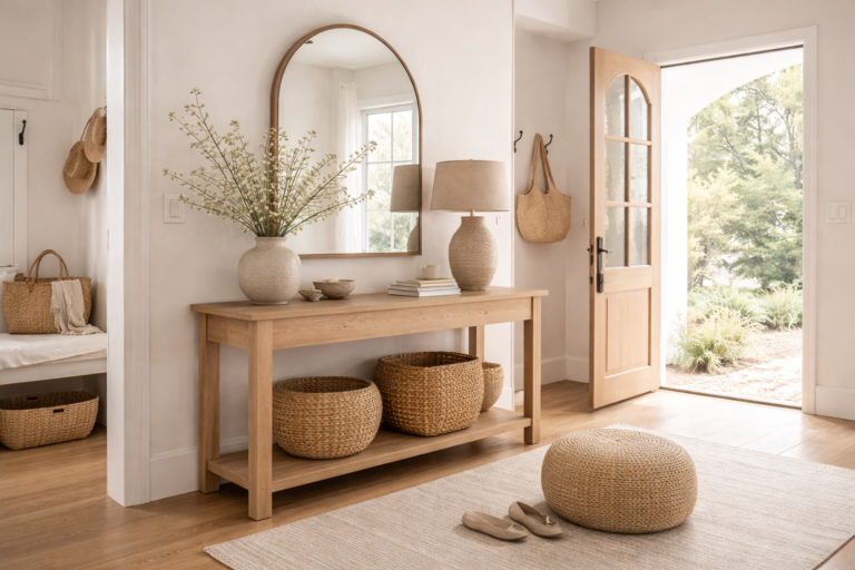
A spring coffee table edit is a swap, not a full redesign. Remove anything that reads heavy or dense, then reintroduce a few lighter elements that look intentional in daylight.
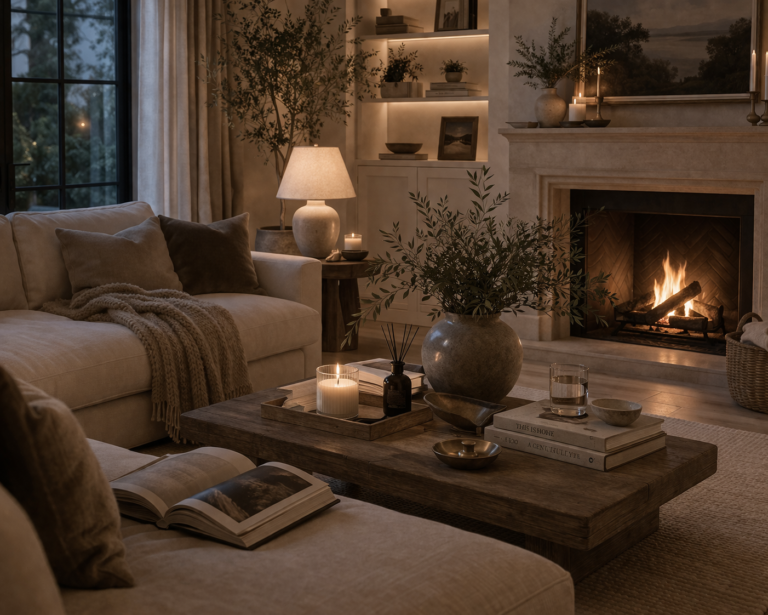
Dense book stacks, deep winter colors, and bulky pieces can feel visually “warm” in the wrong way.
Light stems create movement and make the room feel “open windows” fresh.
Matte ceramics and stone feel calm and high-end—especially in natural light.
Spring styling looks elevated when the table has room to breathe.
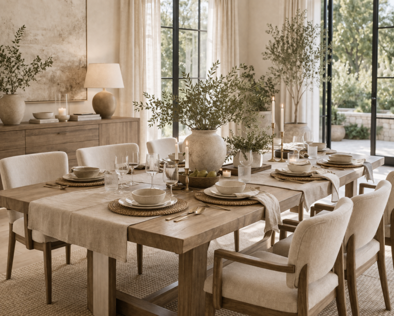
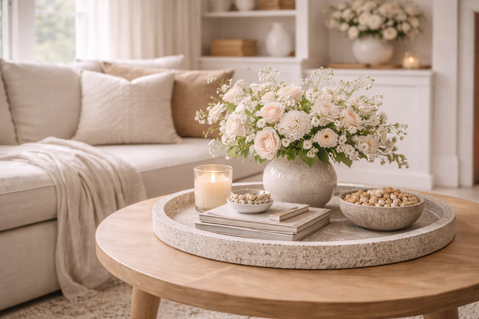
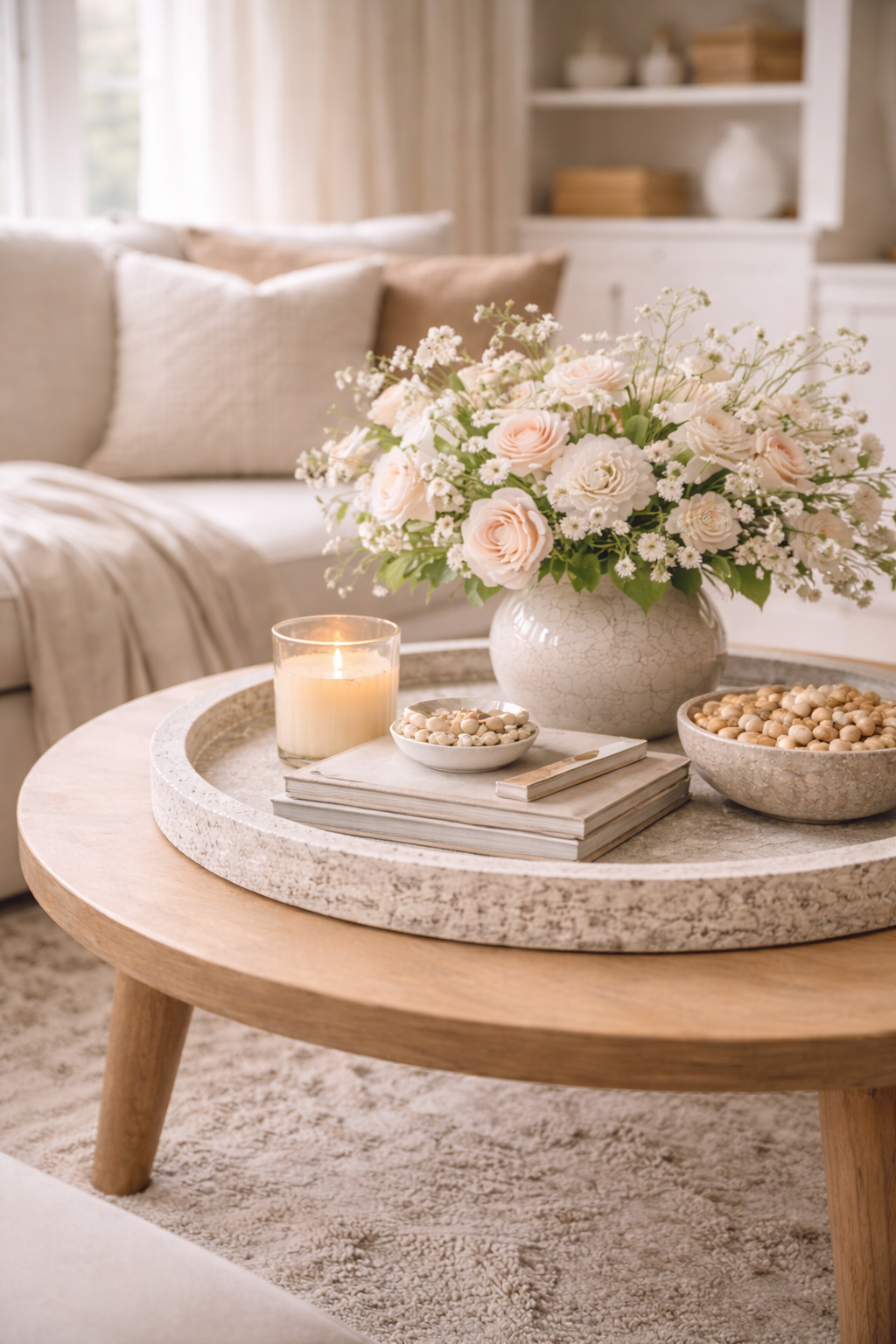
The Spring Coffee Table Formula (Florals + Stone + Soft Contrast)
This is the simplest structure for a coffee table that feels high-end and still works for real life.
A tray or shallow bowl that visually “contains” the styling and keeps it tidy.
Stone, travertine, or ceramic in a matte finish—this is your quiet luxury moment.
Airy stems in a soft palette—keep the arrangement open, not dense.
Leave room for life—coffee cups, books, and remotes. This is what makes it feel curated.
The most elevated coffee tables don’t feel full—they feel intentional.
Florals That Feel Elevated (Not “Seasonal Decor”)
The difference between a high-end floral moment and a seasonal one is shape and restraint. Aim for movement, air, and a palette that blends into your room rather than shouting “spring.”
Look for stems with negative space—branches, light blooms, and soft greens.
Ivory + blush undertones + soft greens read feminine and refined—without being pastel.
Matte ceramic or stone vases look calm in daylight and luxurious at night.
For coffee tables, lower arrangements feel more elevated and conversation-friendly.
Stone & Sculptural Pieces: The Quiet Luxury Anchor
Spring doesn’t have to mean “lighter in everything.” Keep one grounding material—stone, travertine, ceramic, or marble—to make the table feel expensive.
Balance a stone piece with airy stems or a lighter object so the table doesn’t feel weighted.
Sculptural pieces feel best when the silhouette is simple and the material does the talking.
Group stone + vase + one small object on a tray to keep it looking editorial.
Negative space makes stone look more refined and less like “decor.”
Soft Contrast Guide: How to Balance Tones Without Feeling Busy
Soft contrast is the difference between “styled” and “try-hard.” Use gentle tonal shifts instead of high contrast black/white or bright color pops.
If your coffee table feels “too much,” remove one item and widen the spacing. Luxury is often distance.
FAQ: Spring Coffee Table Styling
How do I style a coffee table for spring without looking seasonal?
Focus on materials instead of bright colors: use airy florals, matte ceramics or stone, and a tonal palette (ivory, oatmeal, soft greens). Keep the arrangement minimal and leave negative space so it feels editorial—not themed.
What is the best coffee table decor for an organic modern style?
Organic modern coffee tables look best with one grounding base (tray), one sculptural anchor (stone or matte ceramic), one living element (airy stems), and plenty of negative space. Choose clean shapes and natural textures.
How many items should be on a coffee table?
Most coffee tables look best with a contained cluster of 3–5 elements (including a tray/base). If the table is small, use fewer items and prioritize spacing. Negative space is what makes the styling feel high-end.
What flowers look best on a coffee table?
Choose airy stems and light blooms that create movement rather than dense arrangements. Keep the height low to medium and use a matte vessel so the florals feel calm and refined.
How do I add contrast to a coffee table without using bold color?
Use soft contrast through material and tone: pair warm ivory with stone, add matte ceramics, and introduce subtle blush or sage undertones. Keep shapes clean and spacing generous so the contrast reads elevated.