Texture Over Color: The Elevated Way to Design for Spring
Texture Over Color: The Elevated Way to Design for Spring
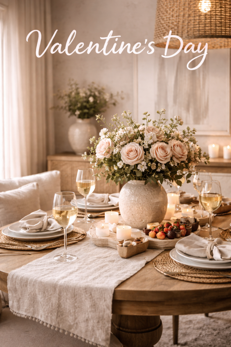
The most expensive spring homes aren’t colorful — they’re dimensional. Here’s how to create a fresh spring feel with layered materials, refined finishes, and soft feminine warmth.
If you want your home to feel like spring without looking seasonal, start with the most luxury-forward principle of all: texture creates freshness better than color. Color can look trendy. Texture looks timeless — and it instantly makes a room feel lighter, softer, and more elevated.
Why Texture Reads More Expensive Than Color
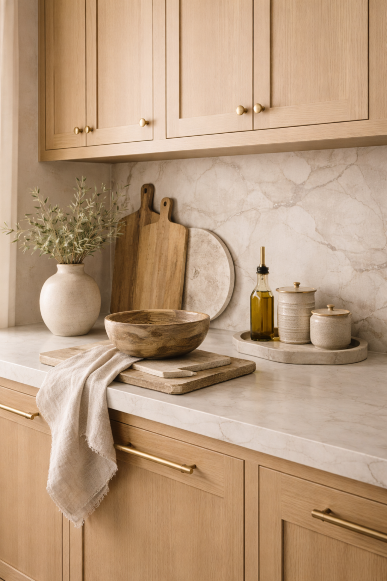
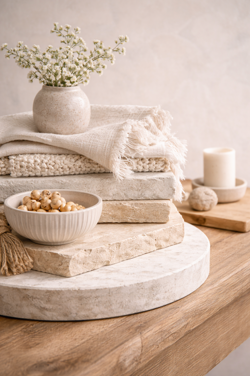
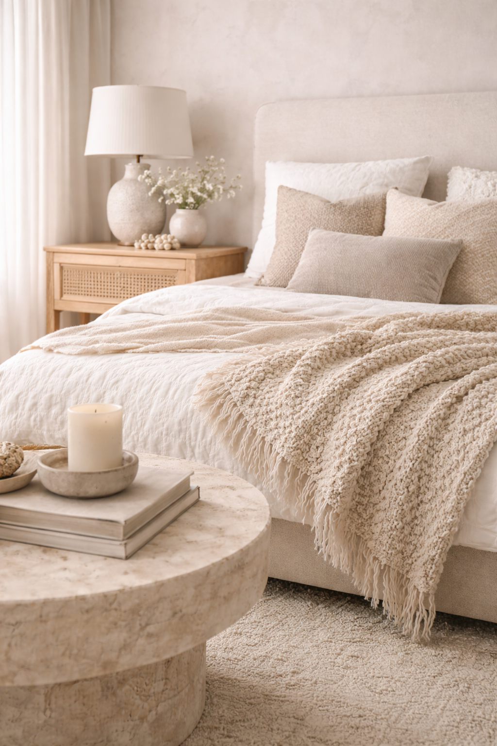
High-end rooms rarely rely on “spring colors” because materials do the work. Linen reflects light differently than cotton. Boucle softens a silhouette. Travertine adds depth without adding visual noise.
The spring luxury shortcut
Keep the palette calm. Add dimension with finishes: matte, woven, brushed, stone, and warm wood.
The Textures That Instantly Feel Like Spring
These materials read “fresh” because they soften contrast and reflect light beautifully — especially in warm neutral, feminine palettes.
Breathable, crisp, and effortlessly elevated.
- Pillow covers + throws
- Bed linens
- Table runners / napkins
Quiet luxury depth without color noise.
- Statement vase
- Decor objects (1–2 max)
- Small trays / catch-alls
Organic warmth with spring airiness.
- Baskets + textured bins
- Woven trays
- Light oak accents
How to Design for Spring Using Texture (Not Color)
Start with one “hero texture” per room
Choose one texture that sets the tone: linen pillows, a boucle chair, a woven tray, or a stone vase. Keep everything else quiet.
Layer three textures in the same color family
The luxury formula is tone-on-tone: textile + hard surface + organic. Example: linen (textile) + matte ceramic (hard) + woven fiber (organic).
Use negative space as a “texture,” too
Spring isn’t about adding more. It’s about letting refined pieces breathe. Clear one surface entirely, then style it with 2–3 objects max.
Keep accents feminine but muted
If you add color, keep it whisper-level: dusty rose, pale clay, or soft sage. The texture should remain the star.
Room-by-Room: Where Texture Creates the Most Impact
Make it feel airy without changing furniture.
- Linen pillow mix (2 textures)
- Woven tray or basket
- Matte ceramic vase
Spring begins with bedding.
- Cotton percale or linen duvet
- One boucle accent pillow
- Stone or ceramic bedside object
Quiet luxury “first impression.”
- Woven catch-all tray
- Textured runner (low contrast)
- One sculptural vessel
Common Mistakes (That Make Spring Styling Look Cheap)
Adding color without upgrading materials
Bright colors on low-quality materials look seasonal fast. Upgrade textures first, then add subtle color if needed.
Too many small objects
Texture needs space. Three curated pieces look designer. Ten pieces looks cluttered — even if they’re “nice.”
Mixing too many competing textures
Choose a consistent finish family: matte + woven + natural. Avoid shiny + rustic + glossy all at once.
FAQ
What textures feel most like spring in home decor?
Linen, cotton, woven fibers (jute/rattan), matte ceramics, light wood, and stone. These materials reflect light softly and feel airy.
How do I make my home feel like spring without changing colors?
Swap heavy textiles for linen/cotton, add one matte ceramic or stone moment, incorporate a woven element, and edit surfaces so everything has space.
Is texture more important than color in interior design?
In high-end design, yes. Texture creates depth and luxury — while color can look trendy. The best rooms use quiet color and strong materials.
How do I keep texture styling from looking messy?
Keep the palette tonal, limit the number of objects, and repeat a finish (matte ceramic, warm wood, linen). The rule: fewer items, better materials.
Editor’s Note
If you want a room to feel “spring,” don’t ask what color to add — ask what texture to lighten. Luxury is dimensional, not loud.