The Colors That Feel Like Spring
The Colors That Feel Like Spring (Without Using Pastel)
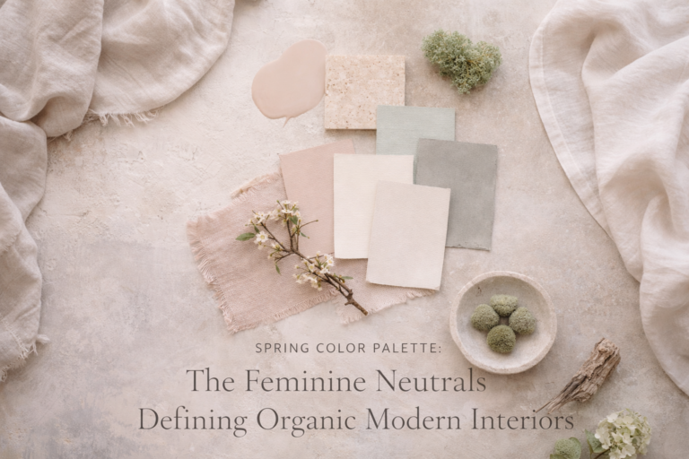
Spring color doesn’t need to be sweet or obvious. These nuanced tones feel fresh, feminine, and elevated — without a single “Easter” vibe.
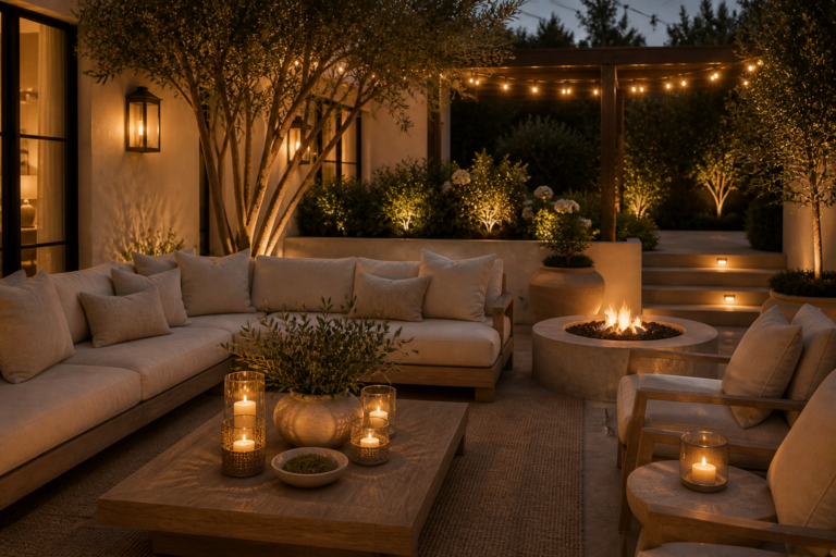
Pastels are the obvious answer — and that’s exactly why elevated spring design rarely relies on them. The most sophisticated spring palettes are desaturated, warm, and light-reflective. They feel fresh because they make the room feel brighter, not because they scream “season.”
Why “Spring Color” Isn’t About Brightness
The secret is undertone. Spring color should feel like morning light — soft, warm, and clean. Instead of adding more color, you’re choosing tones that reflect light and reduce visual heaviness.
Rule #1: Stay low-saturation
Muted tones feel expensive because they don’t compete with materials and texture.
Rule #2: Warm undertones win
Warm ivory, clay, and mushroom read spring-like without looking seasonal.
The Colors That Feel Like Spring (Without Pastel)
These are the tones that consistently read “spring” in a high-end way — because they brighten a room, soften contrast, and pair beautifully with organic modern textures.
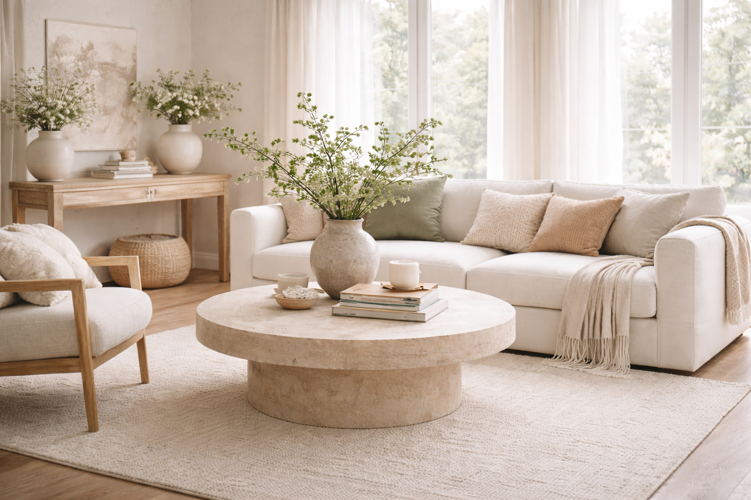
Warm Ivory
The cleanest way to make a room feel brighter without changing its identity.
- Best for: throws, drapery, rugs
- Pairs with: oak, travertine, brass
- Avoid: stark blue-white
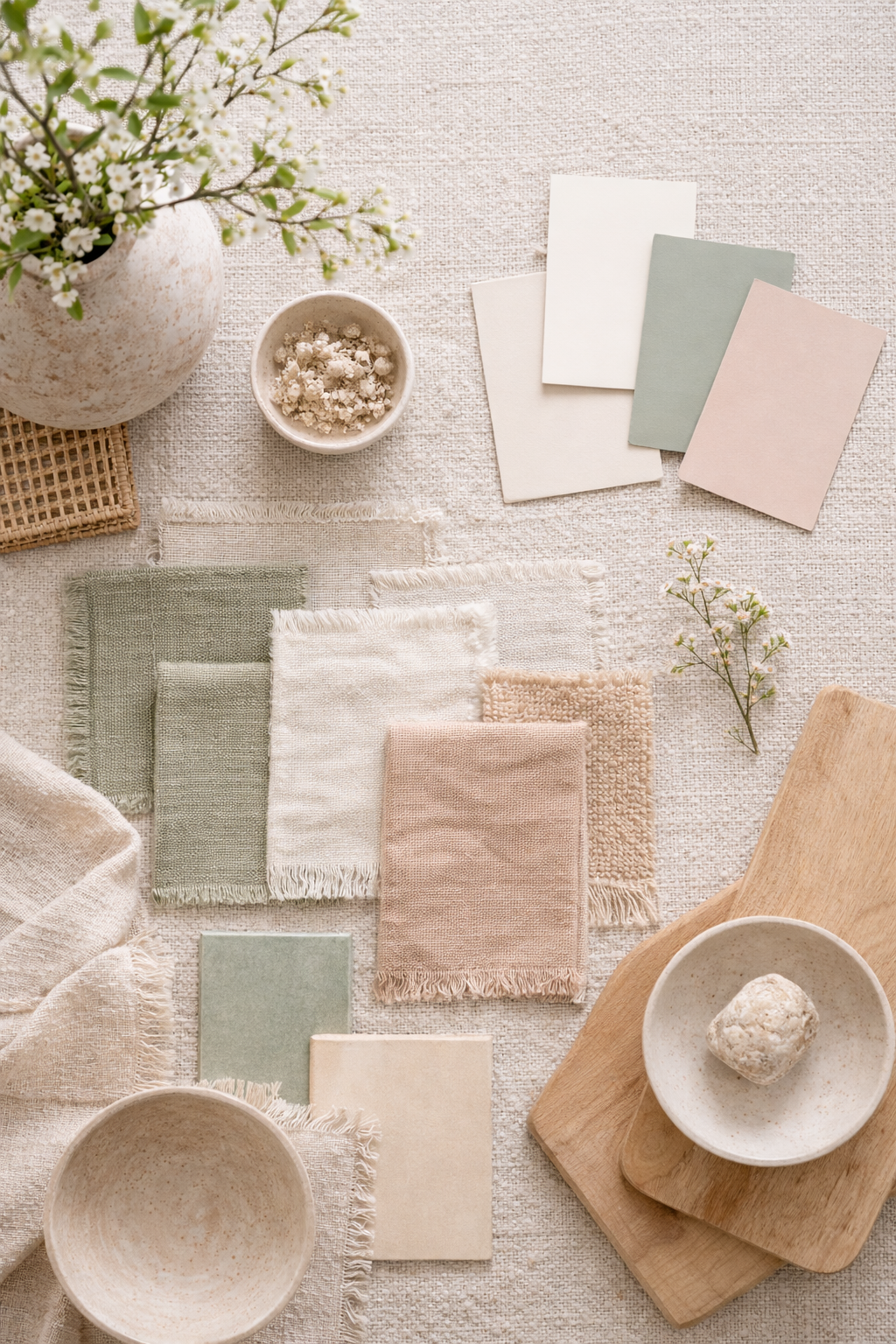
Pale Mushroom
A quiet luxury neutral that feels soft, modern, and understated.
- Best for: pillows, upholstery accents
- Pairs with: cream, stone, muted sage
- Feels: airy but grounded
Muted Clay
Earthy warmth that reads spring-like when it’s desaturated.
- Best for: pottery, art, textiles
- Pairs with: ivory, sand, warm wood
- Avoid: orange-heavy terracotta
Dusty Rose (Desaturated)
Feminine without being sweet — the most “grown-up” spring accent.
- Best for: pillows, bedside accents
- Pairs with: mushroom, ivory, brass
- Keep it: whisper-level
Soft Sage (Whisper-Level)
A fresh tone when it’s subtle — never bright or minty.
- Best for: stems, textiles, small décor
- Pairs with: warm whites, stone, oak
- Avoid: neon greens
Sand Beige
The “sunlit neutral” that makes everything feel softer and calmer.
- Best for: baskets, linens, texture layers
- Pairs with: ivory, clay, natural fibers
- Feels: timeless year-round
How to Use These Colors (So Your Home Still Looks Expensive)
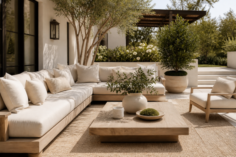
Expensive rooms don’t rely on “color pops.” They rely on controlled repetition and texture contrast.
Use the 70 / 20 / 10 approach
70% foundation neutrals (ivory/mushroom), 20% texture neutrals (sand/stone), 10% accent (clay/dusty rose/sage).
Repeat, don’t scatter
Choose one accent and repeat it 2–3 times in a room (pillow + vase + art), then stop.
Let materials do the work
Boucle, linen, stone, and wood make the palette feel dimensional — even when the colors are quiet.
Avoid high-contrast black accents
If you need depth, use deep bronze, smoked oak, or charcoal — black can feel harsh in spring palettes.
Room-by-Room Spring Color Placement
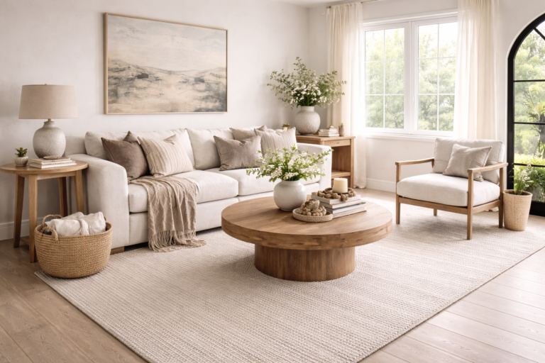
Living Room
Warm ivory textiles + pale mushroom pillows + one muted clay pottery moment.
Bedroom
Ivory bedding + dusty rose accent (minimal) + warm brass lighting for glow.
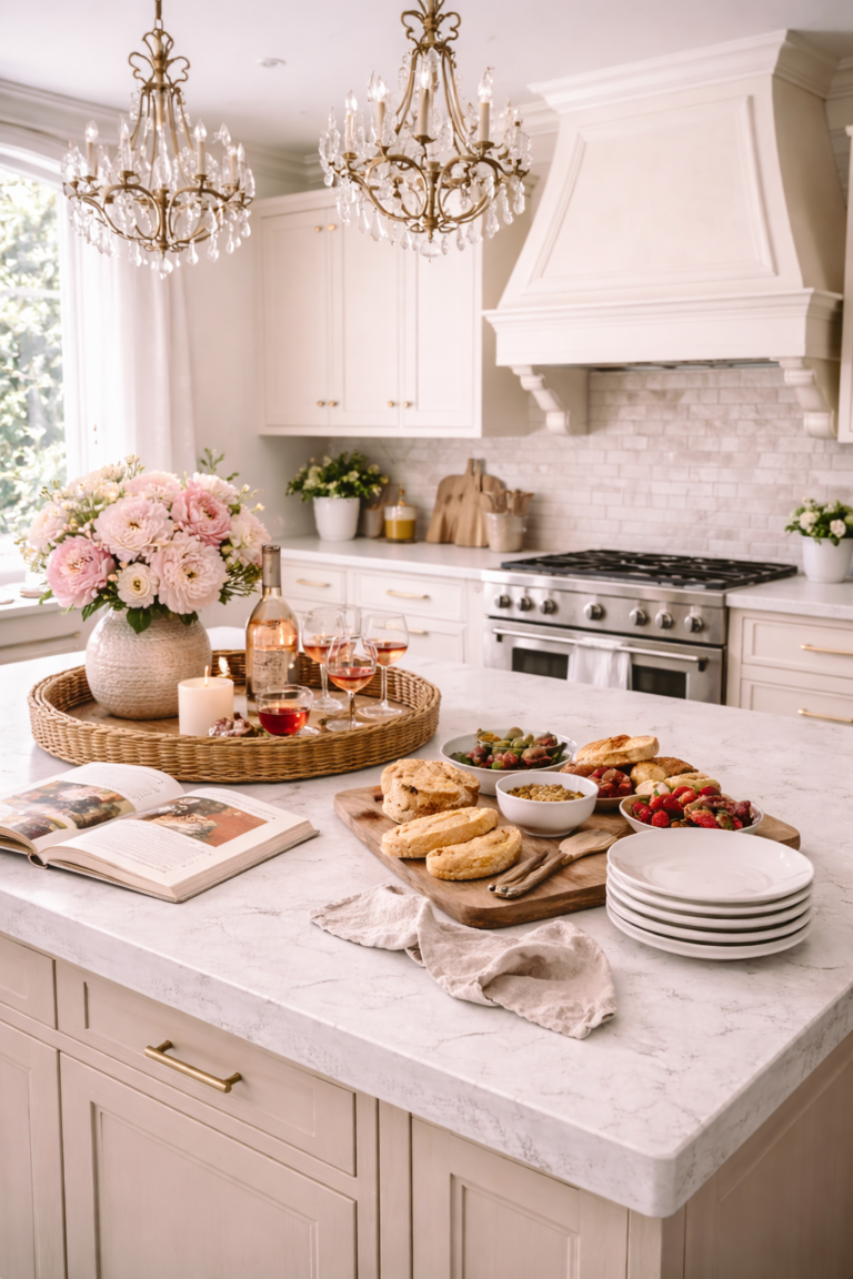
Kitchen / Dining
Stone + sand neutrals with greenery (soft sage), styled in a single statement vessel.
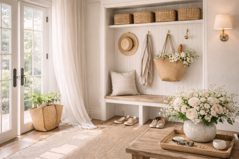
Entryway
Pale mushroom runner + warm ivory ceramics + one curve-forward mirror.
FAQ
What colors feel like spring but aren’t pastel?
Warm ivory, pale mushroom, muted clay, sand beige, dusty rose (desaturated), and whisper-level sage. These tones feel fresh because they reflect light and soften contrast.
How do I avoid my home looking “Easter-themed”?
Avoid high-saturation colors and literal seasonal décor. Keep tones muted, rely on texture, and repeat one accent color rather than scattering multiple colors around the room.
What is the most timeless spring color for interiors?
Warm ivory. It brightens a room instantly, pairs with everything, and reads elevated year-round (unlike stark white or trendy pastels).
Can spring color still feel feminine without pink?
Absolutely. Feminine can be warmth, softness, and light-reflection — think warm ivory, pale mushroom, sand, and subtle clay tones.
Editor’s Note
The most elevated spring palettes don’t look “colorful.” They look sunlit. If your room feels brighter without feeling themed, you chose correctly.