The Language of Timeless Elegance
In a Proper House, color is never an afterthought.
It is not chosen to follow trends or to make a statement.
It is chosen to create a feeling — one of warmth, depth, and quiet confidence.
The palette of a home determines how it is experienced long before any furniture is noticed. It influences how light moves through a room, how materials feel against the skin, and how restful or elevated a space becomes. When color is handled with intention, a home feels settled, composed, and timeless.
This is the foundation of the My Proper House philosophy.
Return to the Design Hub → https://myproperhouse.com/design/
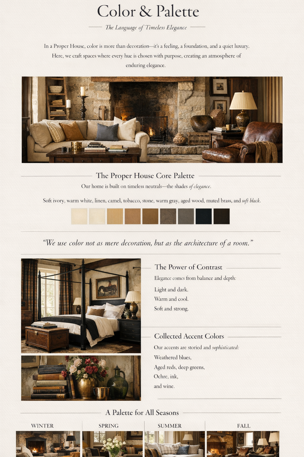
The Proper House Core Palette
Every beautifully layered home begins with restraint.
Before accent colors are ever added, the foundation must be right.
Our core palette is built on timeless neutrals — shades that have appeared in beautiful homes for generations:
- Soft ivory
- Warm white
- Linen
- Camel
- Tobacco
- Stone
- Warm gray
- Aged wood
- Muted brass
- Soft black
These tones form the architectural language of the home. They belong on walls, floors, upholstery, and major furniture pieces. They create continuity from room to room and allow the home to feel calm, cohesive, and grounded.
Neutrals are not boring when they are layered correctly. They are rich, nuanced, and deeply luxurious.
“We use color not as decoration, but as the architecture of a room.”
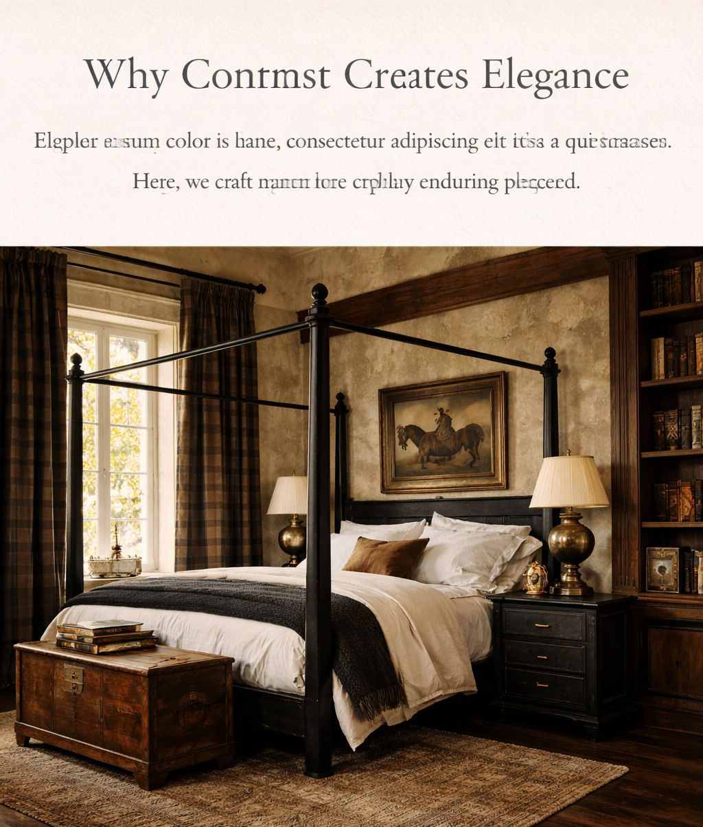
Why Contrast Creates Elegance
True sophistication does not come from brightness — it comes from balance.
A Proper House relies on contrast to create depth:
- Light against dark
- Warm against cool
- Soft against structured
A pale linen sofa feels more elegant when placed against a darker wall.
A black-framed window feels more intentional when surrounded by warm plaster.
A brass lamp glows when paired with a stone tabletop.
Contrast gives rooms dimension and prevents them from feeling flat. This is what makes classic interiors feel quietly powerful rather than decorated.
Collected Accent Colors
Accent colors in a Proper House are never loud or trendy.
They feel as though they were gathered slowly over time.
We draw from tones that feel storied and grounded:
- Weathered blues
- Aged reds
- Deep greens
- Ochre
- Ink
- Wine
These colors belong in textiles, books, artwork, florals, and small furnishings. They are not meant to dominate a room — they are meant to enrich it.
A room should never feel like it was “done.”
It should feel collected.
A Palette That Evolves with the Seasons
One of the most powerful uses of color is its ability to shift a home gently through the year.
You do not need to redecorate — you only need to rotate tones.
Winter brings deeper hues, richer woods, and darker textiles.
Spring softens the home with lighter neutrals and fresh greens.
Summer introduces sun-washed linens, pale blues, and airy layers.
Fall welcomes warmth through camel, rust, and golden undertones.
The structure of the home remains the same. The palette simply breathes with the season.
This is how a house feels alive without ever feeling chaotic.
Winter is deep and grounding.
Rich woods, darker textiles, soft blacks, and warm lighting create a feeling of shelter and quiet.
Spring softens the home.
Pale neutrals, fresh greens, and light-filtering fabrics bring a sense of renewal.
Summer becomes sun-washed.
Creams, soft blues, and breathable linens allow light to move freely through the rooms.
Fall returns warmth.
Camel, rust, and golden undertones layer the home in comfort and richness.
How to Use Color in a Proper House
When choosing colors, ask:
- Does this feel timeless?
- Does it layer well with my existing neutrals?
- Will it still feel beautiful five years from now?
If the answer is yes, it belongs.
Color should never compete with the architecture of your home — it should quietly elevate it.
Design Is a Language
Every shade in a Proper House tells a story.
Not of trends, but of warmth, history, and intention.
This philosophy carries through every part of the home — from how rooms are proportioned to how materials are chosen and how spaces are lived in.
To continue exploring how we design spaces that feel collected, calm, and enduring, return to the Design Hub:
Continue the Design Series