Spring Color Palette
COLOR THEORY • ORGANIC MODERN • FEMININE NEUTRALS
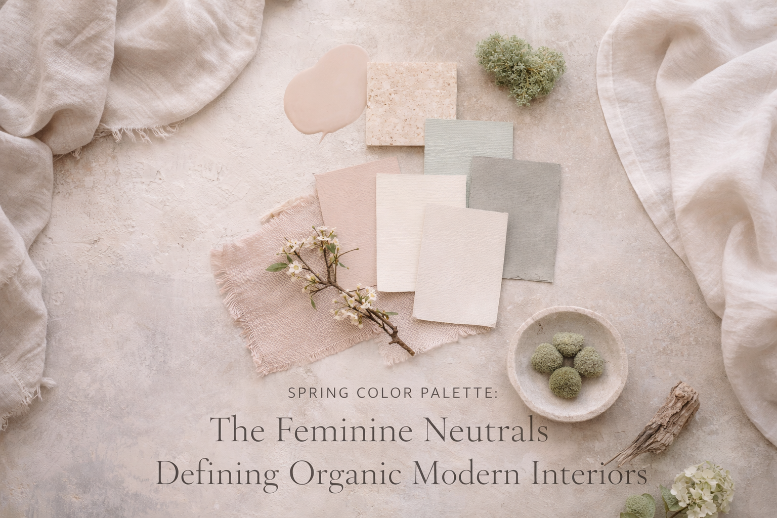
Spring Color Palette: The Feminine Neutrals Defining Organic Modern Interiors
The most luxurious spring palettes don’t shout “color.” They glow. Think sun-washed neutrals, softened greens, and blush undertones that make a home feel calm, feminine, and quietly expensive in natural light.
Why Spring Color Works Differently
In spring, daylight is clearer and more generous. That means undertones show up faster—especially on large surfaces like walls, upholstery, and rugs. A palette that felt “neutral” in winter can suddenly read gray, flat, or cold. Feminine organic modern spring color has one goal: make light look beautiful.
The secret to a high-end neutral palette is undertone control.
Luxury isn’t “beige.” Luxury is a neutral that looks luminous at 8am and still warm at 5pm.
The Feminine Neutral Palette (The Core Set)
This is the signature set for organic modern spring: warm, gentle, and grounded. It photographs beautifully and stays timeless.
Use it to soften rooms and make shadows feel creamy instead of gray. Ideal for walls, large rugs, and bedding.
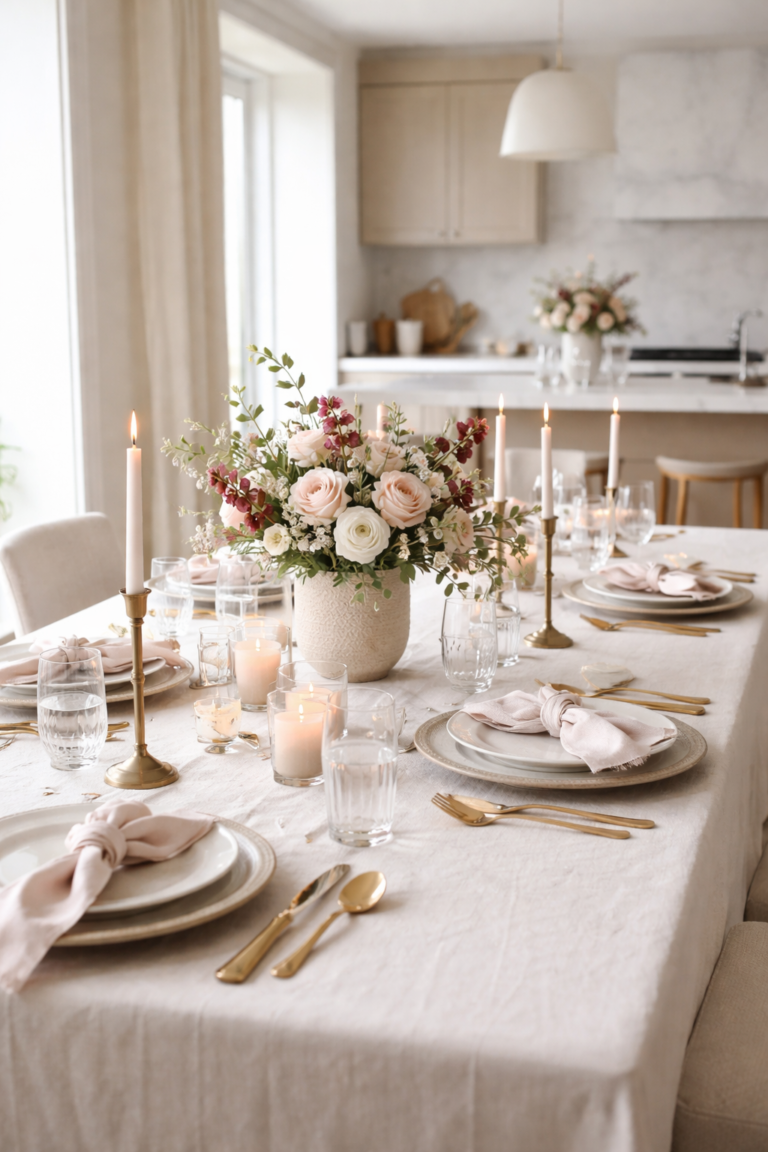
A whisper of blush reads “spring” without feeling themed. Best as an accent: pillows, ceramics, artwork.
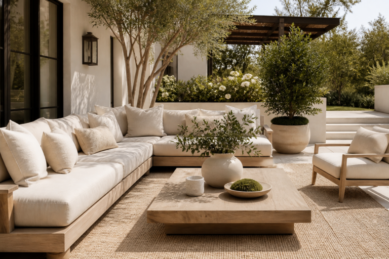
Muted green grounds a neutral room and connects it to the outdoors. Perfect for throws, stems, and small upholstered pieces.
The cool counterpoint that keeps the palette modern. Use sparingly: pottery, stone, or a single textile accent.
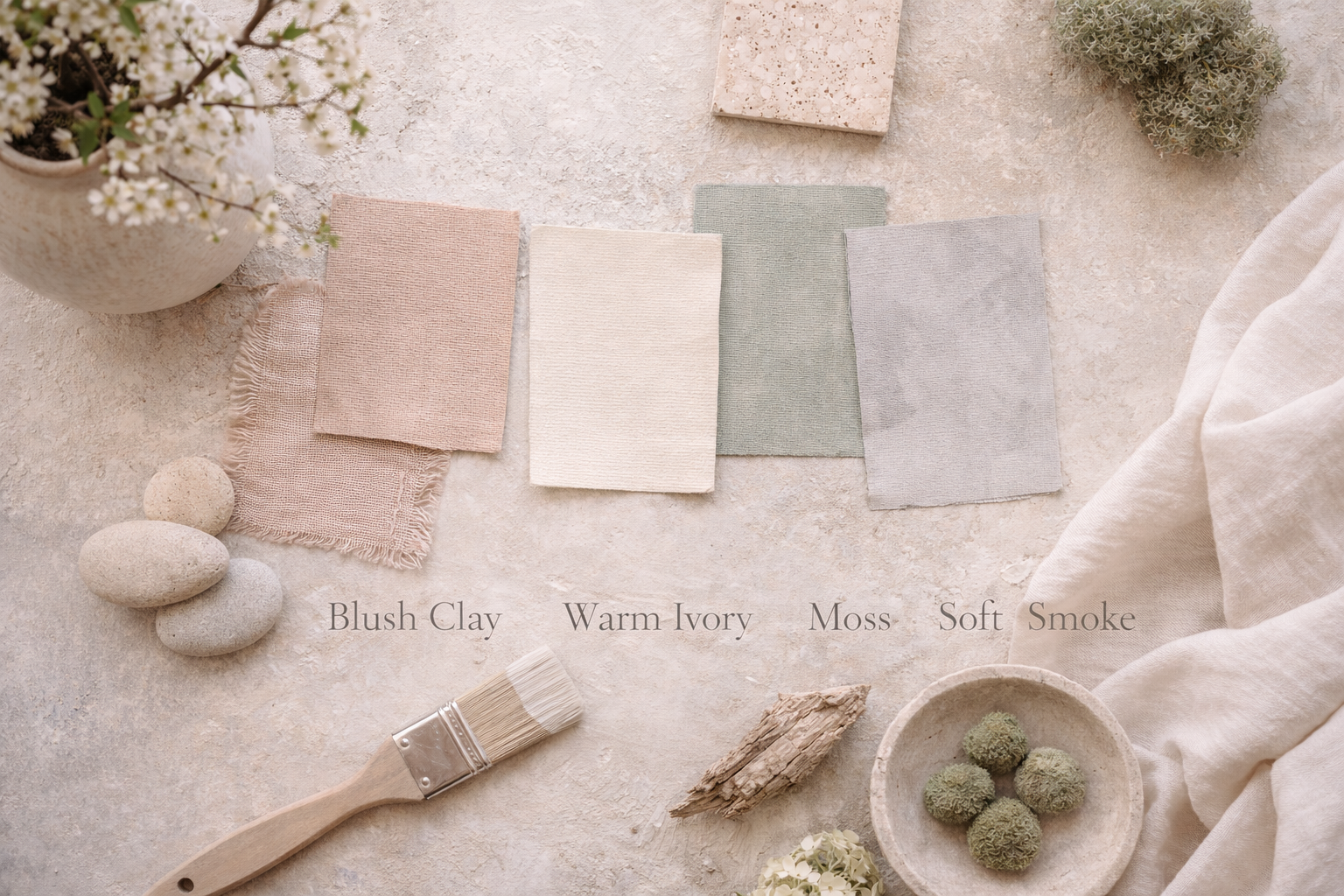
A spring palette is most elegant when each color has a job: one foundation, one warmth note, one nature note, and one cool balancer.
Undertones: The Detail That Separates “Pretty” From “Designer”
Undertone is the subtle color that appears underneath a neutral—pink, yellow, green, or gray. When a room feels “off,” it’s usually undertone conflict. Keep it cohesive by choosing one primary warmth direction (warm ivory + blush clay) and one supporting cool note (soft smoke) that’s used intentionally.
The easiest way to test undertones
Compare neutrals side-by-side in daylight. If one suddenly looks green, pink, or gray, that’s the undertone showing itself. In organic modern, the goal is quiet harmony, not perfect matching.
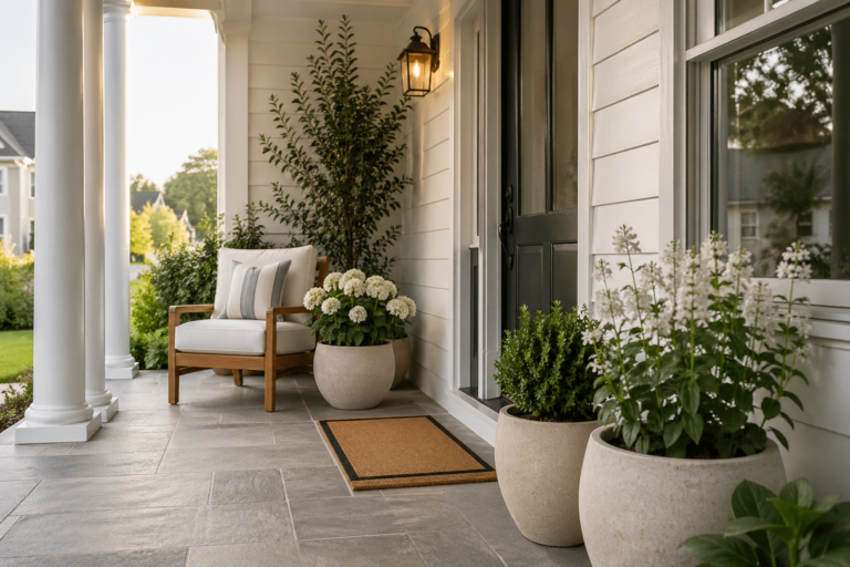
Room-by-Room: Where Each Color Belongs
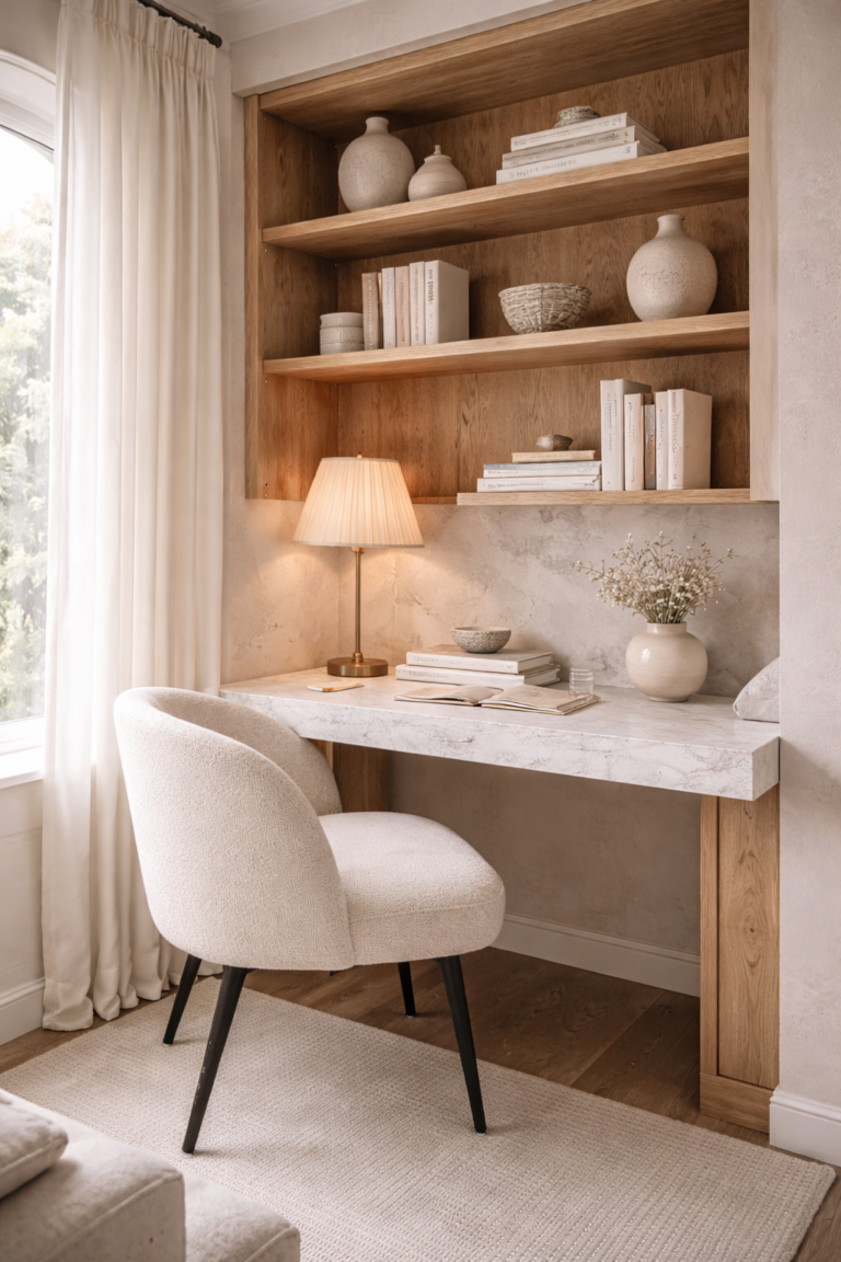
Living room
Use warm ivory as the base (sofa, rug, curtains), blush clay as a subtle warmth note (pillows, art), and moss as the “life” element (greens, a throw). Keep soft smoke for stoneware or one textile to avoid a gray room.
Bedroom
Spring bedrooms feel breathable. Warm ivory bedding + blush clay accents feel feminine and soft. Add moss through stems, a throw, or a small bench cushion so the room feels connected to nature.
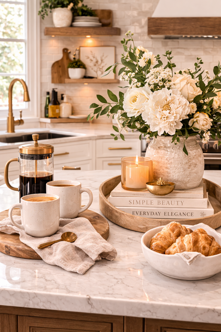
Kitchen + dining
Let materials do the work: creamy walls, warm wood, and stone. Use color through linens and vessels. The most “spring” kitchens are the calmest ones.
Entry
An entry reads elevated when the palette is restrained. Use warm ivory and wood as the base, then add one blush clay ceramic or moss greenery moment.
FAQ
Why do my neutrals look gray in spring?
Spring light is clearer and cooler than winter light, so gray undertones show faster. Warm your foundation with creamy ivory and warm woods, then use “cool” neutrals intentionally.
Can I still use black in an organic modern spring palette?
Yes—treat it like eyeliner. A little defines; too much overwhelms. Pair black with warm neutrals and texture so it feels tailored, not harsh.
What makes a palette feel feminine but not overly sweet?
Use blush as an undertone, not a statement. Keep shapes soft, textures natural, and metals warm. Feminine luxury is quiet and refined.