Neutral Home Office Color Palettes That Feel Calm
Neutral Home Office Color Palettes That Feel Calm
The best neutral home office ideas don’t look “all one color”—they look layered. This guide breaks down greige vs beige vs warm white, how to stack tones so a room feels soft, and the easiest ways to add subtle contrast without breaking your calm palette.
How to Pick a Neutral Palette That Doesn’t Feel Boring
The most common mistake with neutrals is choosing one paint color and repeating it everywhere. Instead, think in layers: a base neutral, supporting neutrals, and 1–2 accent finishes. That’s how organic modern spaces get that RH / Pottery Barn softness.
Quick checklist before you pick paint
- Does your room get cool light (north-facing) or warm light (south/west)?
- Do you prefer neutrals that read creamy (beige/warm white) or soft (greige)?
- What’s your dominant wood tone: oak, walnut, or medium warm?
Pair this post with Organic Modern Home Office Ideas That Feel Stylish (overall look), How to Style a Desk So It Looks Expensive (desktop styling), and Minimalist Home Office Decor That Doesn’t Feel Boring (decor rules).
1) Greige vs Beige vs Warm White (Which One Is Right?)
These neutrals are close cousins, but they behave differently depending on lighting and your finishes. Here’s how to choose a direction without overthinking it.
Warm White
Bright, clean, and creamy—great for small offices or low light.
- Best with: oak, light woods, linen, soft brass
- Avoid: cool bulbs (they can make it feel sterile)
Beige
Classic and cozy—ideal for “quiet luxury” warmth.
- Best with: walnut, warm metals, textured rugs
- Avoid: too-yellow beiges in very warm light
Greige
Soft, modern, and balanced—beige + gray without feeling cold.
- Best with: black accents, stone, medium woods
- Avoid: icy greiges in north-facing rooms
Quick Decision Rule
Use your wood tone as the compass.
- Light oak: warm white or soft greige
- Walnut: beige or warm greige
- Mixed woods: greige (it blends best)
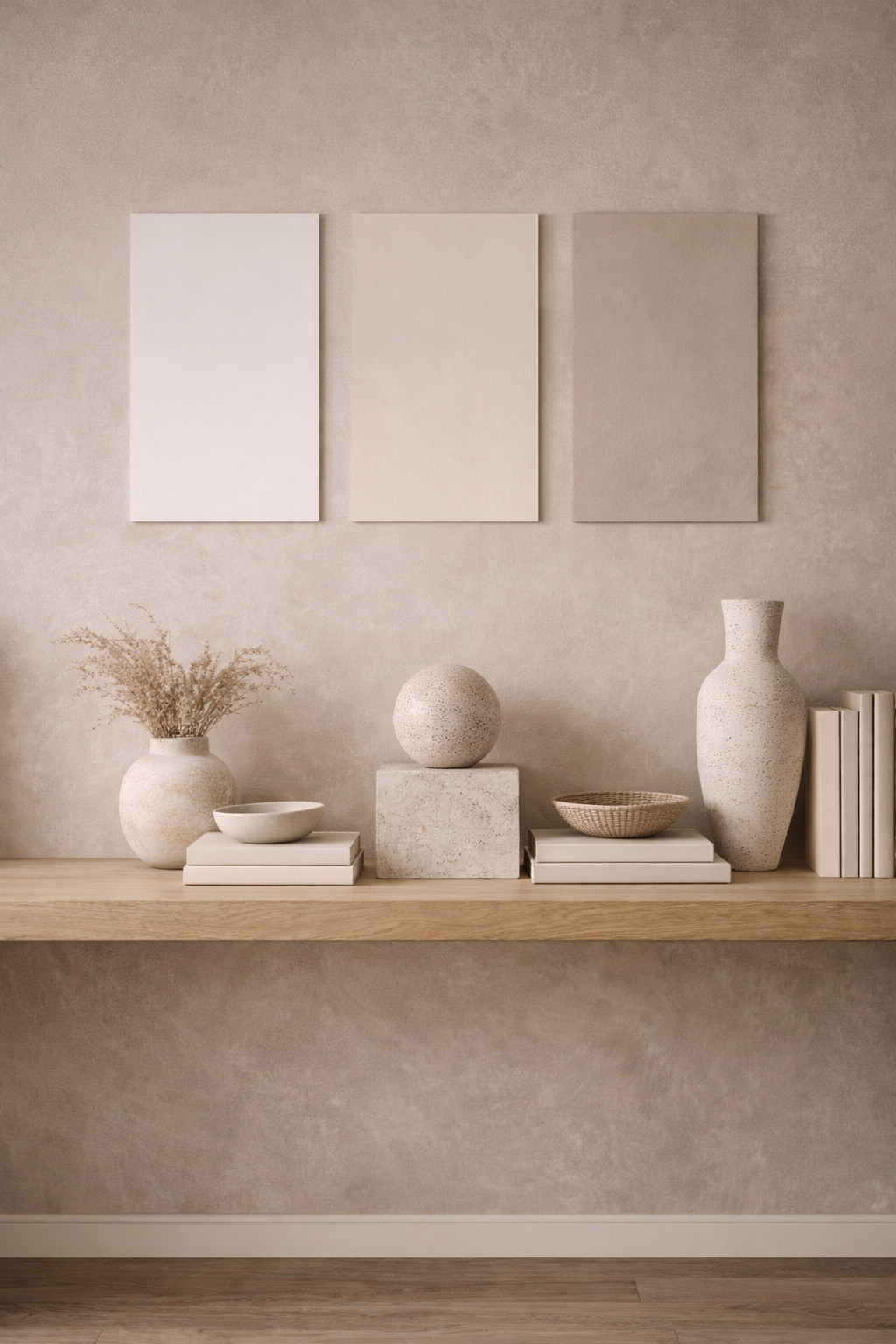
2) Layering Neutral Tones (So It Feels Designed)
Layering is what turns “plain” into editorial. You’re aiming for at least 4 neutral tones across the room, even if they’re subtle.
- Base neutral: walls (warm white / beige / greige)
- Secondary neutral: desk or rug (slightly deeper or warmer)
- Soft neutral: curtains, chair, or cushions (linen/ivory)
- Grounding neutral: accents (taupe, mushroom, soft charcoal)
3) Preventing Neutral Rooms From Looking Flat
If everything is the same value (lightness/darkness), neutrals can feel washed out. The fix is adding value contrast—not color.
- Outline: add one soft-black or bronze element (lamp, frame, hardware)
- Ground: a rug with a slightly deeper border or pattern
- Anchor: one darker wood (walnut) or a deeper taupe accent
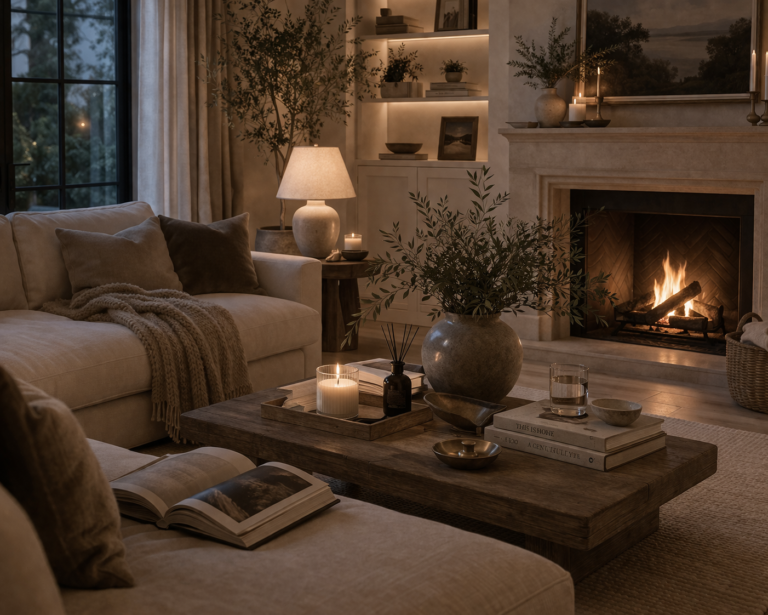
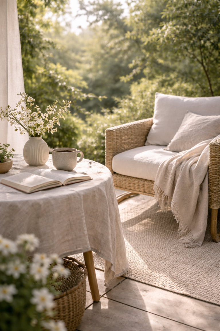
4) Using Texture With Neutral Colors (The Organic Modern Secret)
Texture is the difference between “basic beige” and “RH-level cozy.” When your palette is quiet, the room needs tactile materials to keep it interesting.
- Soft: linen curtains, boucle chair, wool throw
- Woven: rug, basket, or subtle rattan detail
- Natural: oak/walnut desk, stone tray, ceramic vase
- Matte: lamp, frames, and hardware in low-sheen finishes
5) Adding Subtle Contrast (So It Still Feels Soft)
Subtle contrast gives a neutral office structure. Think “soft edges,” not high-contrast black and white. Keep contrast warm and repeat it in small touches.
- Warm white + taupe (clean, calm, modern)
- Beige + soft black (editorial, grounded)
- Greige + bronze (polished without feeling harsh)
- Ivory + walnut (warm “quiet luxury”)
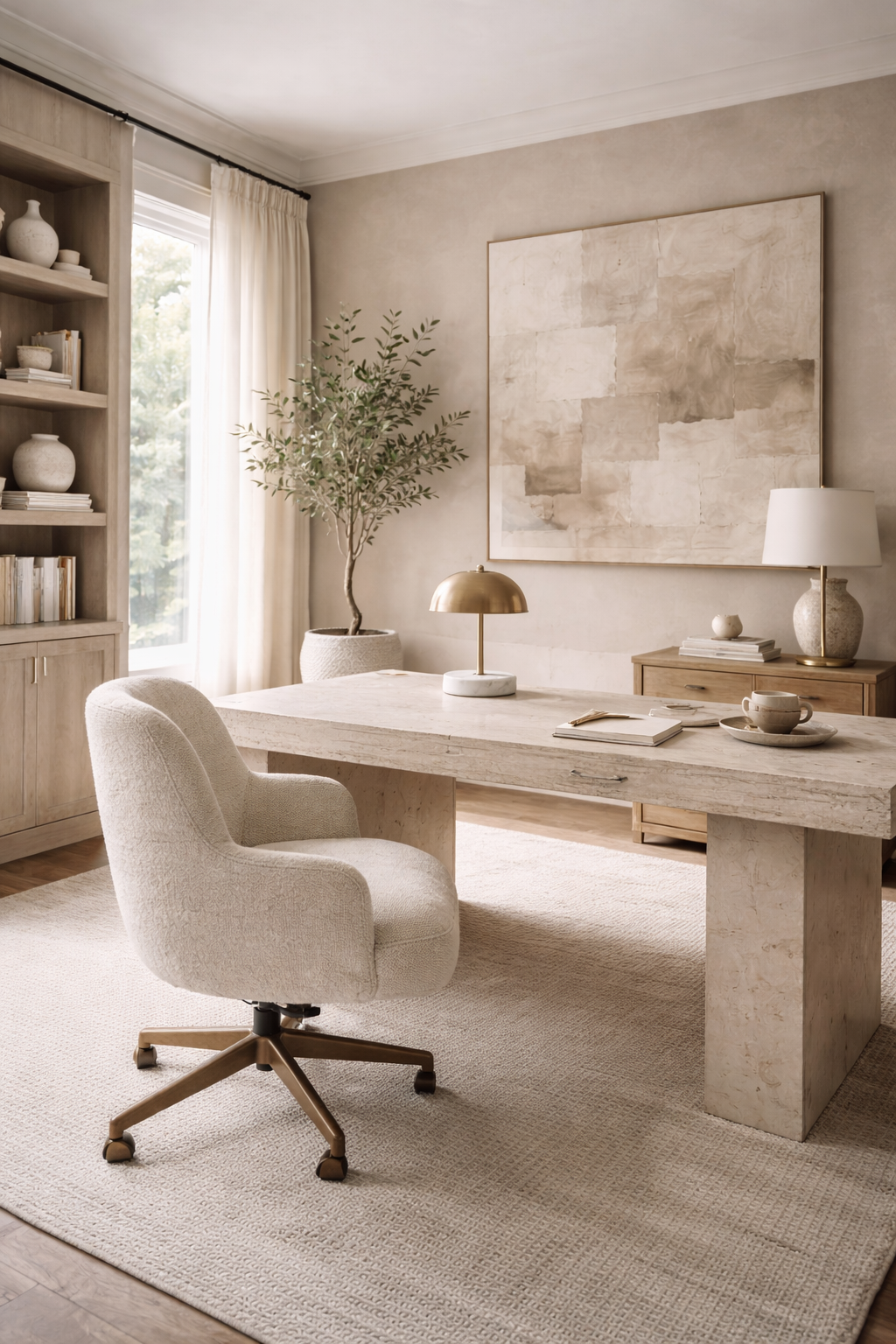
6) Neutral Palette “Recipes” You Can Copy (Organic Modern Edition)
Use these as plug-and-play formulas when you want a cohesive home office quickly. They also photograph beautifully for Pinterest.
Palette A: Warm White + Oak + Linen
Airy and calm, perfect for small offices.
- Walls: warm white
- Wood: light oak
- Metals: soft brass
- Accent: ivory + sand textiles
Palette B: Beige + Walnut + Bronze
Grounded “quiet luxury” with depth.
- Walls: beige or warm greige
- Wood: walnut
- Metals: bronze / aged brass
- Accent: taupe + soft black details
Palette C: Greige + Stone + Soft Black
Modern organic with a crisp edge.
- Walls: greige
- Texture: stone / travertine
- Metals: matte black + soft brass mix
- Accent: warm ivory textiles
Palette D: Ivory + Mushroom + Medium Wood
Soft, layered, and extremely calm.
- Walls: ivory
- Secondary: mushroom / taupe
- Wood: medium warm
- Accent: ceramic + woven textures
FAQ: Neutral Home Office Color Palettes
What is the best neutral color for a calm home office? +
How do I keep a neutral office from looking flat? +
Is greige or beige better for an organic modern home office? +
What accent colors work with neutral home office ideas? +
What lighting makes neutral paint look better? +
Internal linking note: Replace “#” links (in other cluster posts) with your real URLs once published to strengthen topical authority.