Texture Over Color: The Elevated Way to Style a Coffee Table for Spring
Texture Over Color: The Elevated Way to Style a Coffee Table for Spring
If you want your home to feel spring-ready without looking “seasonal,” change the materials—not the palette.
Why Texture Over Color Looks More Expensive
Color can feel seasonal fast. Texture feels architectural. When you style with texture, your coffee table reads as quiet luxury—even in a simple neutral palette.
The spring shift is subtle: lighter weaves, matte finishes, natural materials, and more negative space.
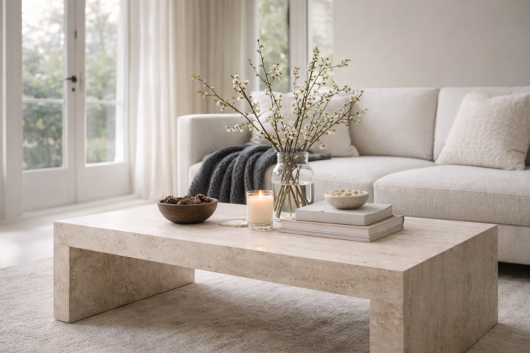
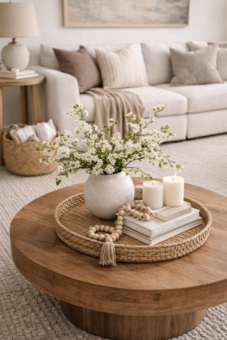
The Texture-First Coffee Table Formula
Think in layers of material. The goal is contrast you can feel, not color you notice.
A tray or shallow bowl in wood, stone, or ceramic to “contain” the styling.
Stone, travertine, or matte ceramic—this is where the “expensive” feeling starts.
A linen runner, a subtle weave, or a tactile object that softens the hard materials.
Stems or greens for movement—keep it light and open, not dense.
If you’re tempted to add more, edit instead. Texture needs space to read.
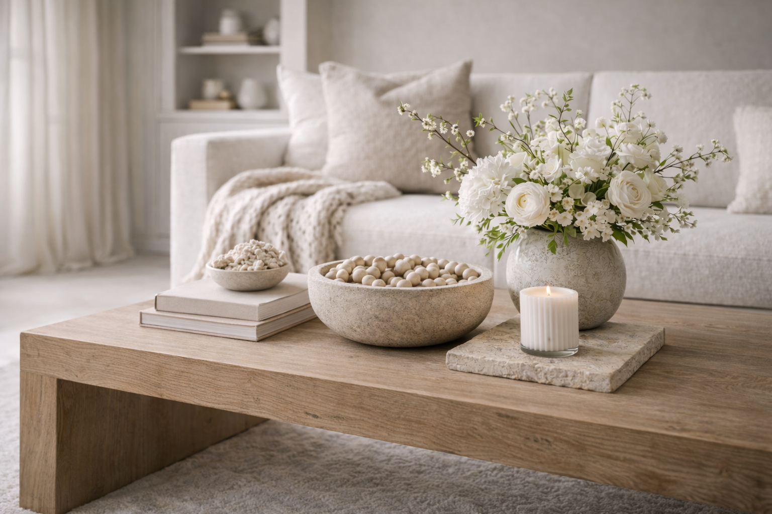
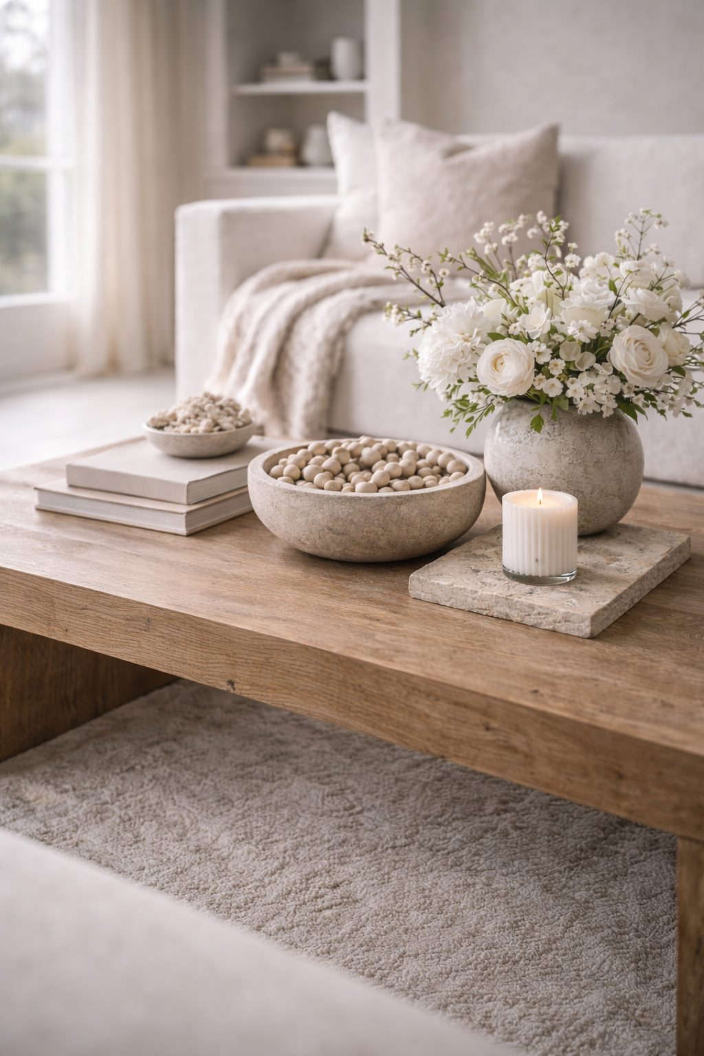
Best Spring Textures for an Organic Modern Coffee Table
These materials translate as elevated in daylight, photograph beautifully, and avoid the “seasonal decor” look.
Calm, modern, and soft in bright spring light—especially in warm whites and creamy tones.
The grounding texture that makes the entire table feel “quiet luxury” instead of “decorated.”
Use linen as a whisper of softness—not a full runner that dominates the table.
Let the coffee table show. Spring styling looks best when wood isn’t covered up.
Texture Palette Matrix (Easy Combinations That Always Work)
Use these combinations as a blueprint. Keep the palette quiet and let the materials do the work.
Warm ivory + light wood
Travertine / stone bowl
Airy greens + matte ceramic vase
Oatmeal neutrals
Matte white ceramics
Blush undertone stems + linen detail
Soft sage hints
Stone + wood tray
Champagne glow (minimal) + airy florals
Keep your “soft finish” to one note. Too many textures can look busy instead of elevated.
Common Mistakes (and the Quick Fix)
Fix: Swap three small items for one sculptural piece and add space around it.
Fix: Move back to neutrals and add texture: linen, stone, matte ceramics, natural wood.
Fix: Mix matte + natural. One glossy piece at most; spring looks best in matte finishes.
Fix: Contain the styling on a tray and keep the rest of the table open for real life.
FAQ: Texture-First Spring Coffee Table Styling
How do I style a coffee table for spring without adding a lot of color?
Use texture as the spring signal: add linen or a soft weave, choose matte ceramics, incorporate stone or travertine, and finish with airy stems. Keep the palette neutral and focus on negative space.
What textures look most high-end on a coffee table?
Stone (including travertine), matte ceramics, natural wood, and linen are the fastest route to a quiet luxury feel. Clean shapes and matte finishes look especially elevated in spring daylight.
How do I keep texture styling from looking cluttered?
Contain your styling on one tray, choose one sculptural anchor piece, and leave the rest of the surface open. Texture needs space to read—editing is what makes it feel expensive.
What is the best texture-based coffee table formula?
Use one base (tray), one anchor (stone or matte ceramic), one soft layer (linen or weave), and one airy living element (stems/greens). Keep it low, tonal, and spacious.
What colors work best with texture-first spring styling?
Warm ivory, oatmeal, and soft greige are ideal bases. Add subtle blush undertones and soft sage hints through florals or textiles for a feminine spring feel—without looking seasonal.