Layering for Spring: Linen, Florals & Light in the Formal Dining Room
Layering for Spring: Linen, Florals & Light in the Formal Dining Room
A refined layering approach that feels feminine, airy, and expensive—without feeling staged. This is the “quiet luxury” version of spring.
Why Spring Layering Looks So High-End
The fastest way to make a formal dining room feel “designed” is to layer soft textiles with controlled contrast and a light-forward palette. It reads elevated because it has depth—without visual clutter.
Think of spring layering as a gentle upgrade: you keep the structure (table, chairs, chandelier, art), but you soften the room’s edges with linen drape, airy florals, and light that feels flattering all day.
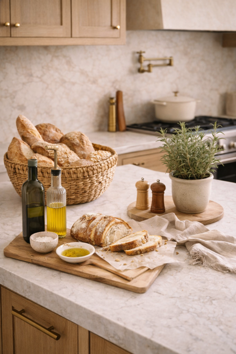
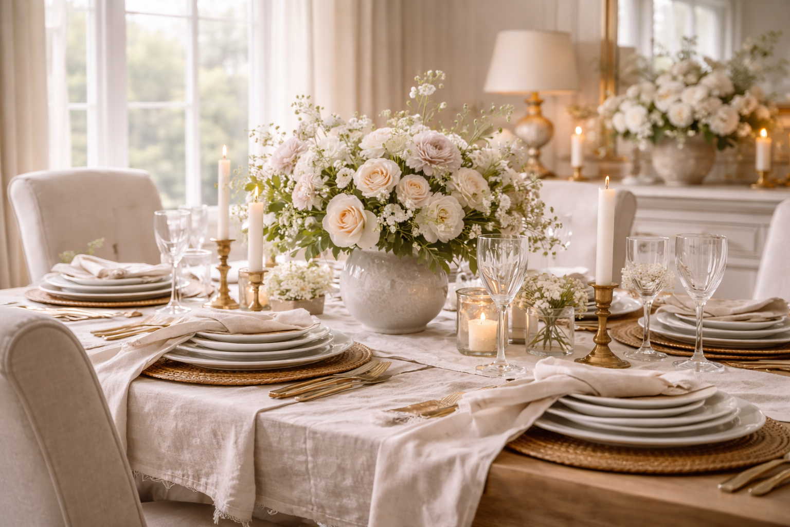
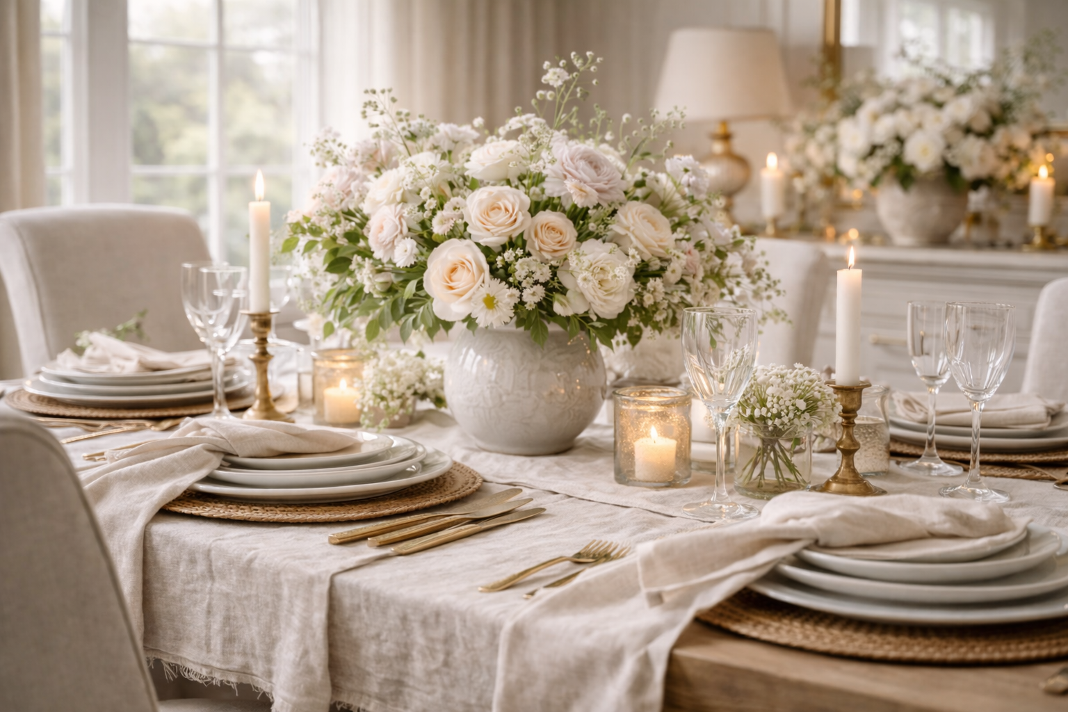
Start with linen: runner, napkins, or a soft tablecloth moment. Linen adds “quiet texture” immediately.
Add low profile ceramics or stone pieces—these ground the look so the room still feels formal.
Finish with one airy floral arrangement and minimal candlelight. Spring is about breathing room.
Balance daylight and evening warmth. The most beautiful rooms look good at 10am and 8pm.
Linen: The Texture That Makes Everything Look Softer (and More Expensive)
Linen is spring’s signature because it’s both relaxed and refined. It takes the formality of a dining room and makes it feel welcoming—without losing polish.
How to use linen without looking wrinkled or casual
- Choose a quiet neutral: ivory, oatmeal, warm stone, or a barely-blush undertone.
- Layer intentionally: runner + napkins is enough. Avoid stacking too many patterns.
- Keep the edges clean: let the linen have a gentle drape, but keep the rest of the table edited.
- Texture over print: if you want “floral,” do it through the flowers—not the fabric.
Pro styling move: use linen as a “matte” layer against glossy elements (glassware, framed art, chandelier crystals). That contrast reads premium.
Florals: Feminine, Airy, and Never Fussy
The most elevated spring florals are not tight arrangements. They’re loose, light, and asymmetrical—like the room just naturally became beautiful.
Think blush, cream, or pale peach. Keep it tonal—not high contrast.
Use movement greens (not dense evergreen). The goal is lift, not weight.
Matte ceramic, stone, or warm glass. Let the vessel feel sculptural and quiet.
Low-to-mid height for dining. If you go taller, keep stems sparse and airy.
Light: The Layer People Forget (and the One That Changes Everything)
Spring light is not just “more daylight.” It’s a softer quality of brightness—and your dining room should echo that. A single lighting adjustment can make linen look richer and florals look more luminous.
A simple light plan for a formal dining room
Let windows breathe. Clear visual clutter near the glass and consider a sheer layer for glow.
Use warm, flattering bulbs and a dimmer if possible. One candle moment adds softness.
One reflective element (mirror, art glass, subtle metal) bounces light and feels expensive.
Keep the room visually calm so light becomes the “feature.” Less décor, more atmosphere.
Do’s & Don’ts: The Elevated Spring Layering Edit
DOMake it feel intentional
- Repeat one tone (ivory + champagne) across the room for quiet cohesion.
- Layer in threes: one linen layer, one grounding piece, one floral moment.
- Use matte finishes so the room feels calm and not shiny everywhere.
- Keep edges clear so the table still feels formal and host-ready.
DON’TAccidentally make it busy
- Over-pattern with floral prints + floral arrangements at the same time.
- Use dense greenery that reads winter or holiday.
- Stack small décor across the table—cluster instead.
- Go bright white everywhere; warm ivory is more flattering and elevated.
FAQ: Linen, Florals & Light in a Formal Dining Room
What is the best fabric for spring dining room styling?
Linen is the most classic spring choice because it adds softness and texture while still looking refined. Warm neutrals (ivory, oatmeal, stone) feel elevated and photograph beautifully.
How do I style florals for spring without making them look busy?
Use a simple formula: one soft bloom, one airy green, and one quiet vase. Keep the arrangement loose and asymmetrical, and avoid pairing floral prints with a heavy floral centerpiece.
What colors look most expensive for spring in a formal dining room?
Warm ivory, oatmeal, muted blush, and soft sage are timeless and feminine without reading overly pastel. Pair them with champagne brass or warm antique gold for a quiet-luxury finish.
How can I make my dining room look brighter in spring?
Remove dark visual weight near windows, introduce linen layers that reflect light, and add one subtle reflective surface. For evenings, warm bulb temperatures and a dimmer keep the room flattering and inviting.
Should I use a tablecloth in a formal dining room for spring?
You can—especially if you keep it tonal and relaxed. A linen tablecloth can look very elevated in spring, but it should feel soft and draped rather than stiff and overly formal.