Materials & Textures for Spring
MATERIALS • TEXTURE • SPRING LAYERING
Materials & Textures for Spring: Layering Linen, Limewash, Wood, and Stone
In a luxury organic modern home, materials are the décor. Spring is the season where texture becomes visible—because daylight reveals everything. The goal is a layered, feminine calm: matte surfaces, tactile textiles, and grounded natural elements.
Why Texture Matters More in Spring
Spring light is honest. It shows flat paint, shiny finishes, and synthetic fabrics instantly. That’s why the most elevated spring homes lean into matte, natural texture. Texture creates depth without adding clutter—and it makes neutrals feel expensive.
The Spring Material Stack (A Designer Formula)
A balanced organic modern room typically uses one soft textile, one matte wall surface, one warm wood, and one stone. Repeat that stack across the home for cohesion.
Best in drapery, throws, bedding, and slipcovers—places where fabric can breathe and move with air.
Softens walls by diffusing light. The finish reads “architectural” and elevates even simple rooms.
Choose oak, reclaimed wood, or aged walnut tones. Wood is the emotional warmth behind the palette.
Travertine, limestone, marble, or textured ceramics. Stone gives the room quiet weight and timelessness.
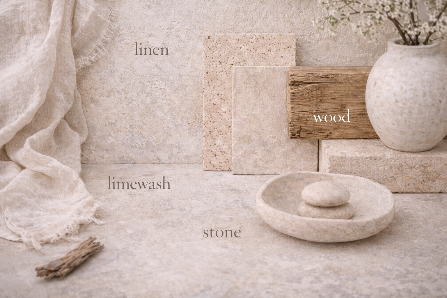
When materials are cohesive, the room feels “designed” even with minimal décor.
How to Layer Without Making the Room Feel Heavy
Rule 1: Keep the largest surfaces matte
Matte surfaces (walls, rugs, upholstery) create calm. Shine is best used in small amounts—like a gentle highlight, not the main story.
Rule 2: Mix textures within the same color family
The luxury move is not adding more colors—it’s adding more texture in the same tone: ivory linen + ivory boucle + ivory plaster = depth without noise.
Rule 3: Use stone and wood as “anchors”
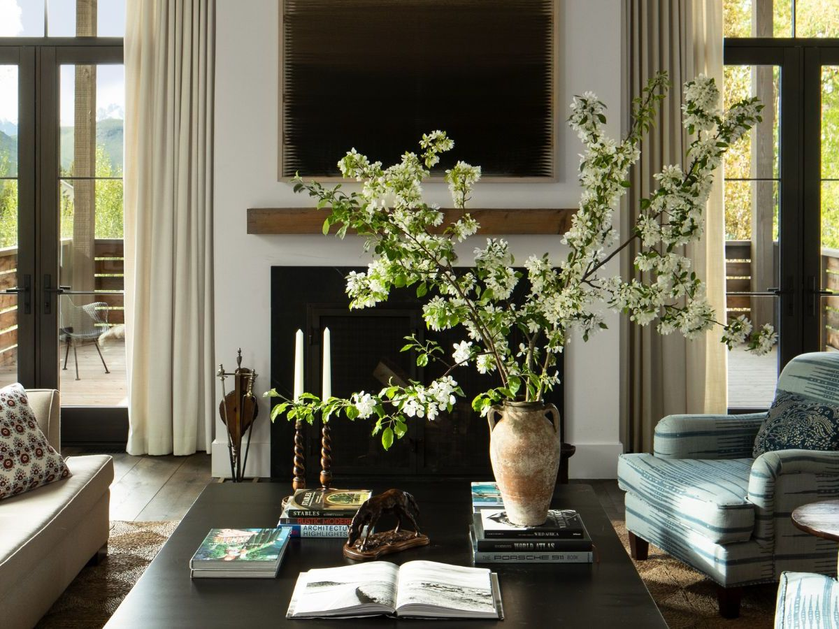
If a room feels floaty, add weight: a wood coffee table, a stone bowl, or a grounded ceramic vessel. Anchors make softness feel intentional.
Room-by-Room: Where Each Material Shines
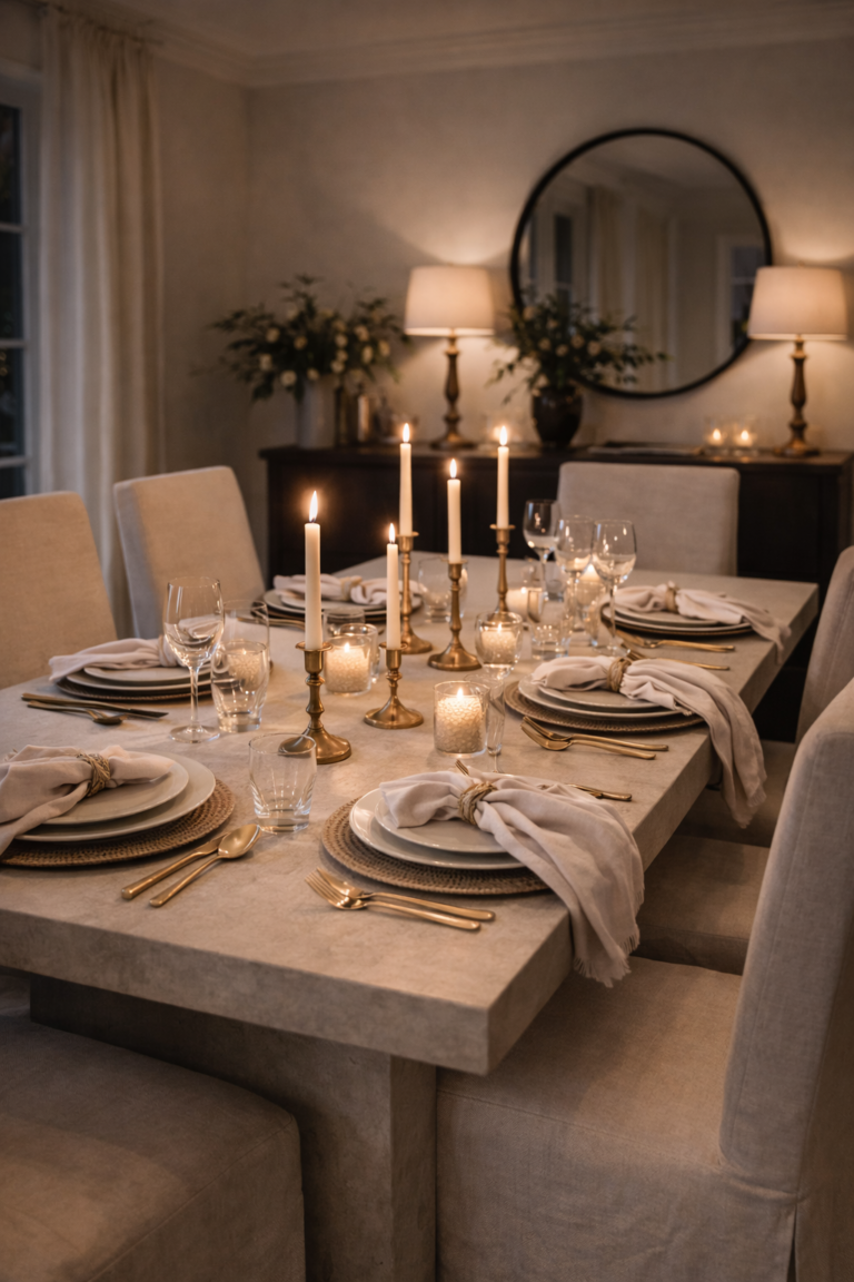
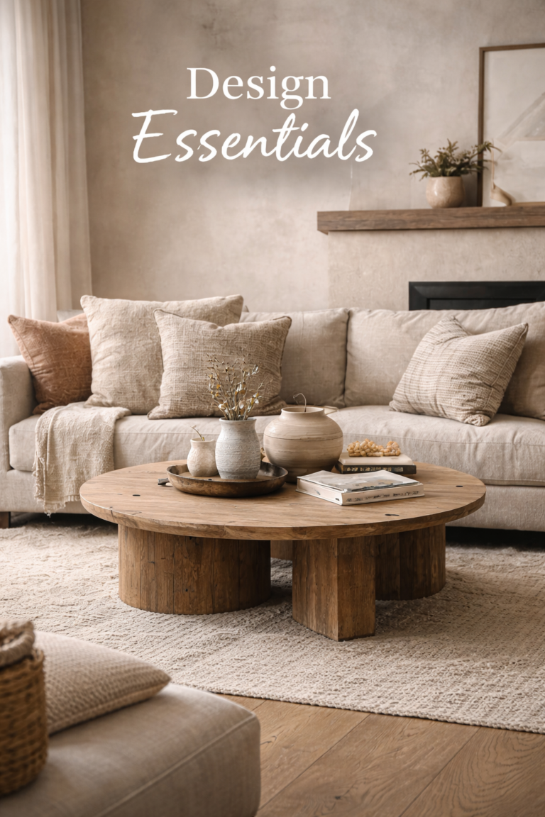
Living room
Linen in drapery + textured rug + wood table + one stone or ceramic statement (bowl or lamp base). Keep accessories minimal.
Kitchen
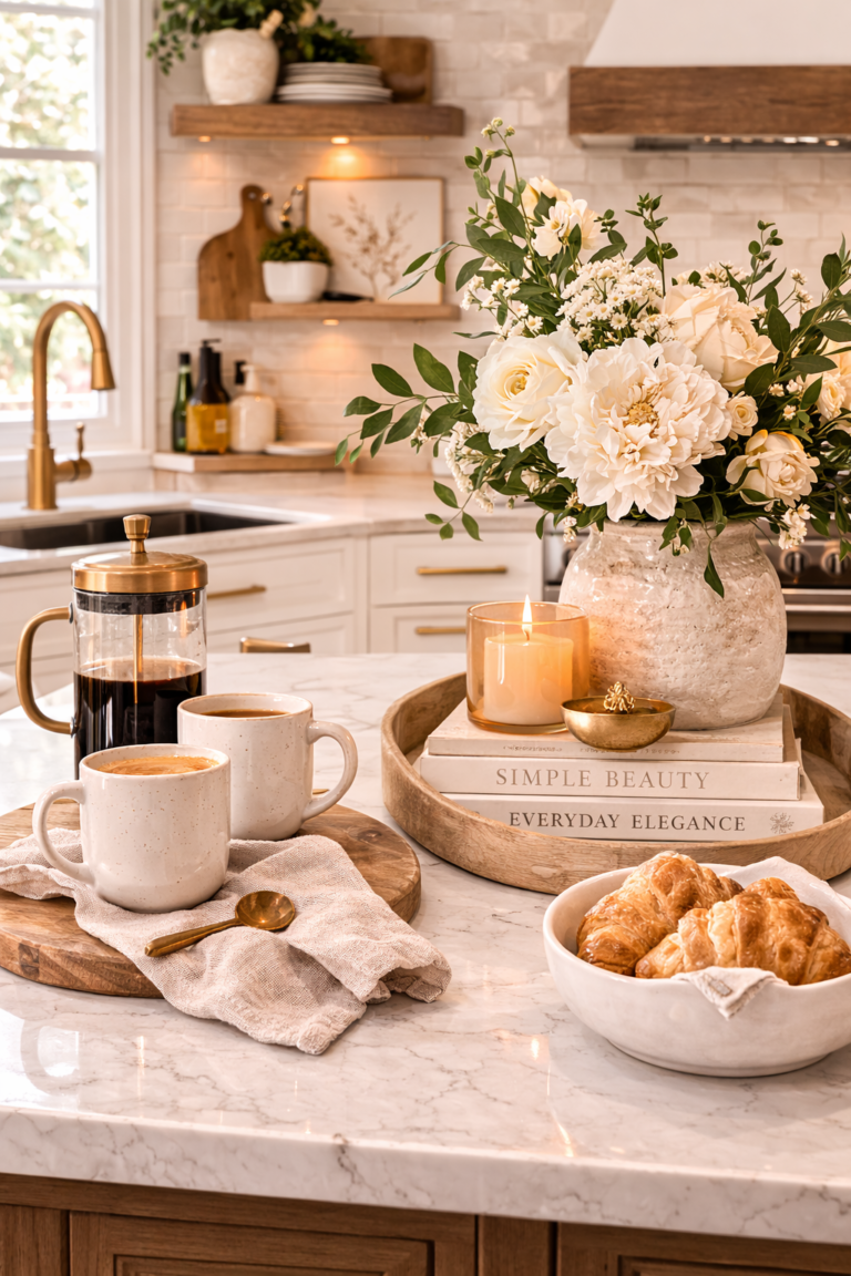
Let stone and wood lead. Use linen as the soft counterpoint: towels, runners, and simple window treatments. Matte ceramics elevate counters without clutter.
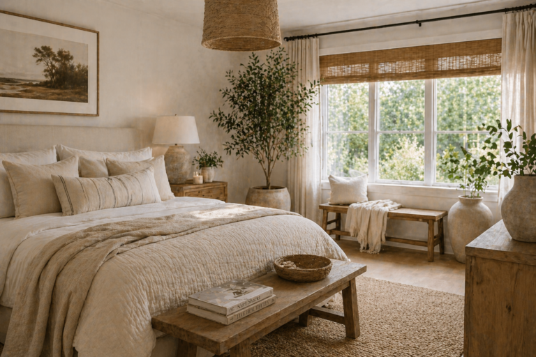
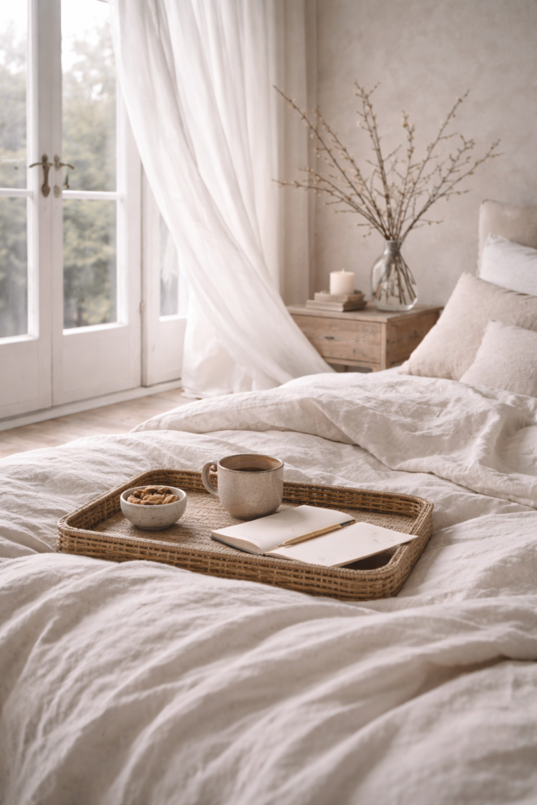
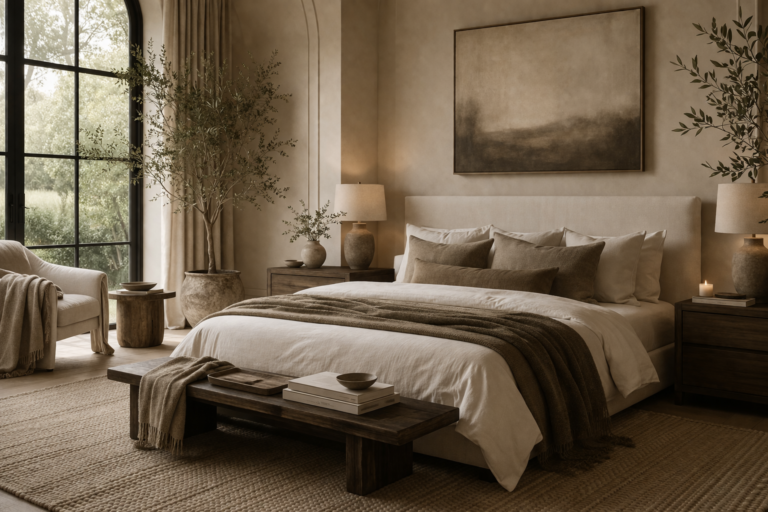
Bedroom
Linen and layered textiles are the hero here. Add stone through a lamp base or tray to balance softness with permanence.
FAQ
Does limewash work in every home?
It’s most beautiful in spaces with natural light because it diffuses and softens shadows. If you prefer a cleaner look, consider a matte paint in a warm ivory tone for a similar effect.
How do I avoid a room feeling “too beige”?
Increase texture and add one muted nature note (moss or olive green). Beige feels elevated when it has depth and a grounded material story.
What makes materials look expensive?
Matte finishes, honest texture, and consistency. When wood tones and stone tones harmonize, everything looks intentional—without needing extra décor.